作者:李誉辉
四川大学在读研究生
前言
这篇是作者总结的目前最全的R语言—图片组合和拼接,当然常言道:百密必有一疏,欢迎大家在评论区留言本篇没有总结到的用于图片组合和拼接的R包。做教程狠费精力的,别忘了点赞和转发。谢谢。
1customLayout包
参考来源:
https://www.rdocumentation.org/packages/customLayout/versions/0.2.0
https://mp.weixin.qq.com/s/zbp8pOQcNB4XBBF5SCg5GA
1.1 简介
customLayout用于拼图特别方便,尤其是仪表盘布局
支持R内置的base绘图对象,ggplot2对象(与grid结合 )
Hide
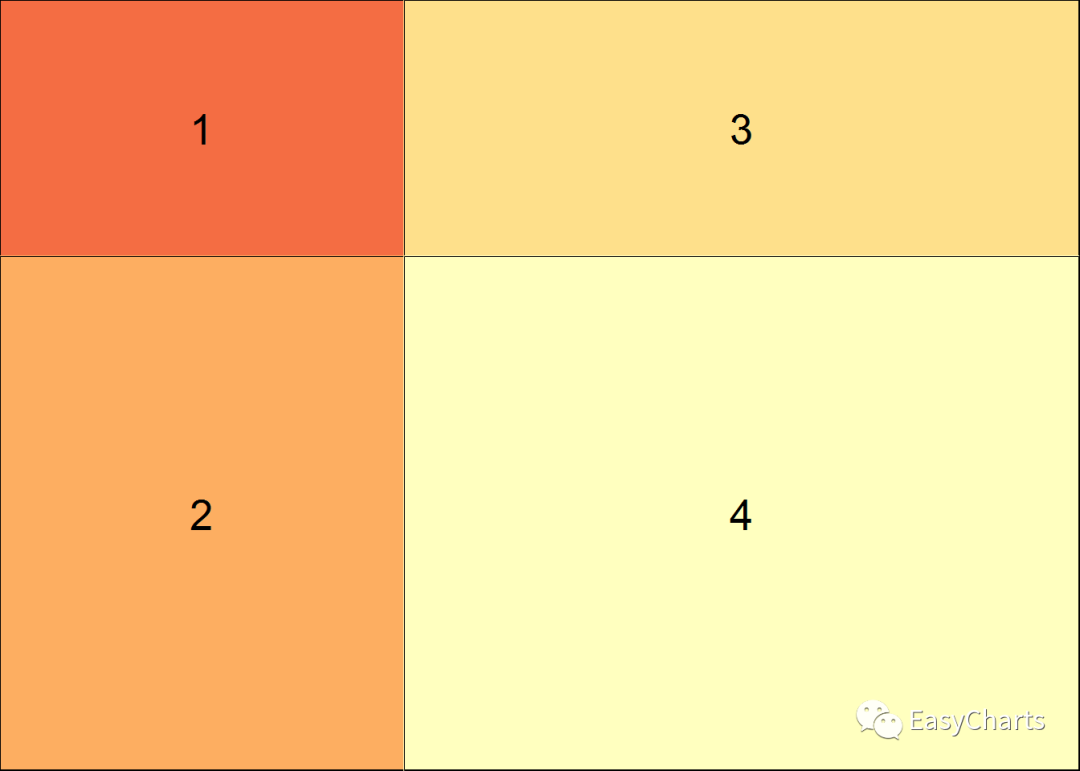
library(ggplot2)library(customLayout)1.2 简单画布
通过设置简单的数字矩阵以及对应的宽高比,可以非常方便的设置出来数字拼图
关键函数:
lay_new() 创建拼图画布
lay_show() 显示拼图画布
mat数字矩阵必须从1开始,且必须连续
library(ggplot2)library(customLayout) #
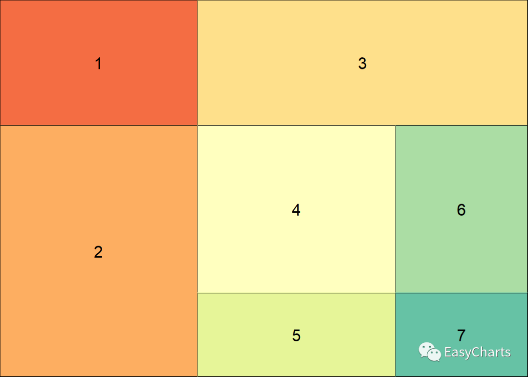
创建拼图画布lay1 <- lay_new( mat = matrix(1:4, ncol = 2), #
矩阵分布,mat表示指定排版的数字矩阵 widths = c(3,2), # 设定宽度比例 heights = c(2,1) #
设置高度比例)# 显示拼图画布lay_show(lay1) # 创建第2个拼图画布,与第1个结构一样,只是比例不一样 lay2 <-
lay_new( matrix(1:4, nc = 2), widths = c(3, 5),heights = c(2, 4))
lay_show(lay2)
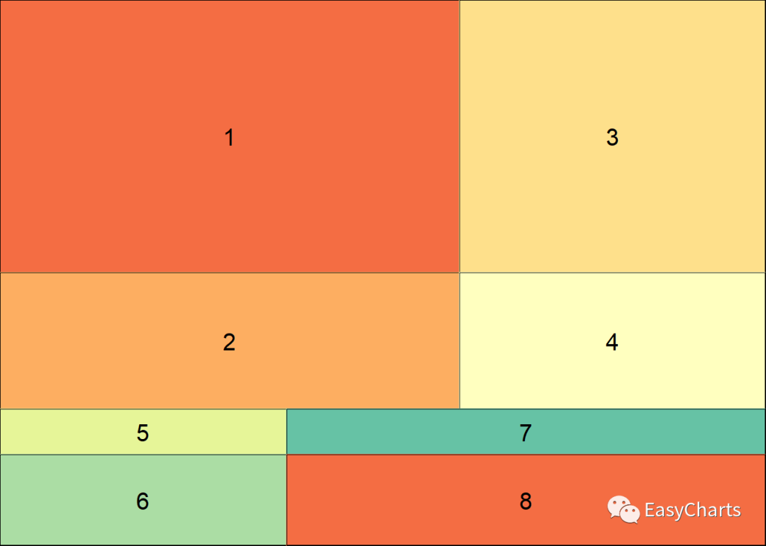
1.3 画布合并
其它拼图包没有的功能,非常好用
跟合并矩阵类似。分为行合并和列合并
lay_bind_col() 画布列合并 lay_bind_col(x, y, widths = c(1, 1), addmax = TRUE) 参数widths表示指定合并宽度比
lay_bind_row() 画布行合并 lay_bind_row(x, y, heights = c(1, 1), addmax = TRUE) 参数heights表示指定合并高度比
library(ggplot2)library(customLayout)#
画布列合并 cl_1 <- lay_bind_col(lay1, lay2, widths = c(3, 1)) #
指定合并宽度比为3:1 lay_show(cl_1)# 画布行合并 cl_2 <- lay_bind_row(lay1, lay2,
heights = c(3, 1)) # 指定合并高度比为3:1 lay_show(cl_2)# 多次合并
lay_show(lay_bind_col(cl_1, cl_2, widths = c(2:1)))
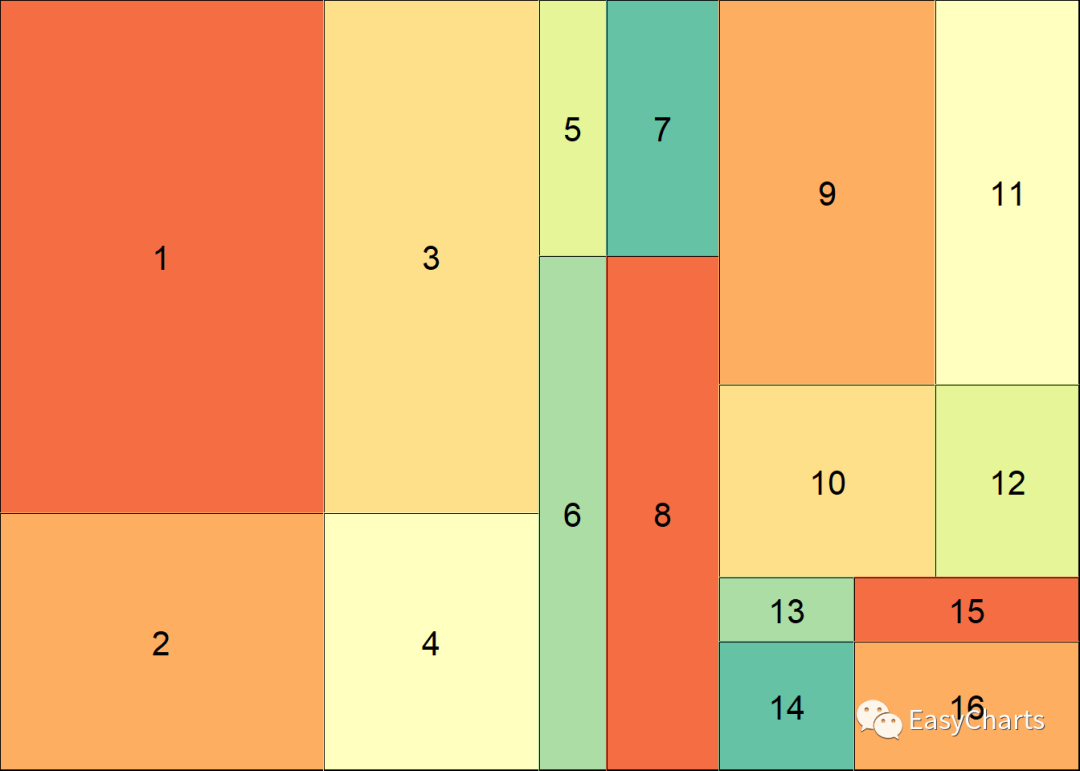
1.4 画布嵌套
这个功能也是其它包没有的,非常有用
关键函数:
lay_split_field(lay, newlay, field)
参数lay表示大画布,参数newlay表示要嵌套进去的小画布,field表示指定要嵌套的区域编号
library(ggplot2)library(customLayout)
slay <- lay_split_field(lay1, lay2, field = 1) #
将画布lay2嵌套进lay1的第1个区域,即左上角格子 lay_show(slay)
library(ggplot2) library(customLayout)
slay2 <- lay_split_field(lay = lay2, new = lay1, field = 4) #
将画布lay1嵌套进lay2的第4个区域,即右下角格子 lay_show(slay2)
1.5 填充图片
关键函数:
lay_set(layout) 将画布layout设置为绘图布局,用于base绘图对象
lay_grid(grobs, lay, ...) 将绘图对象grobs填充到画布lay中, 用于ggplot2等绘图对象
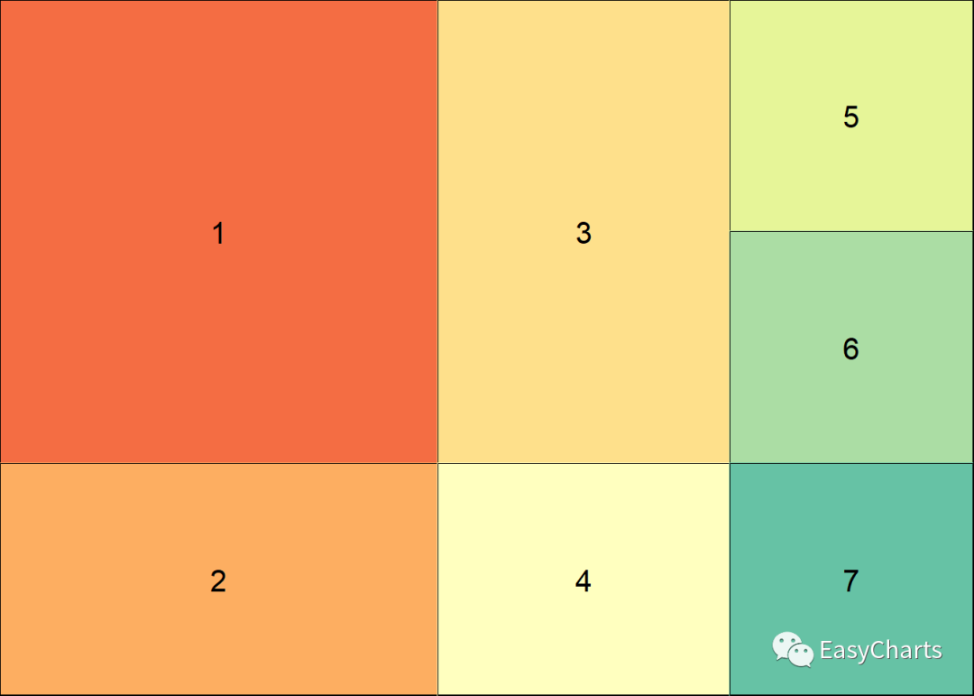
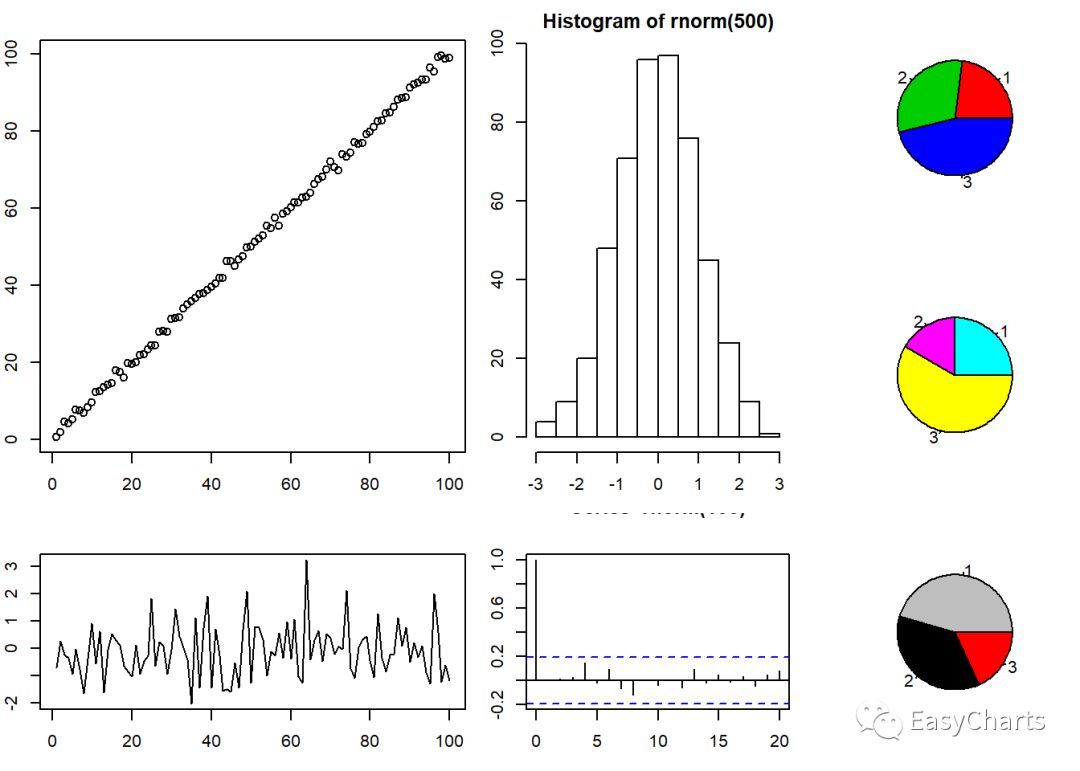
1.5.1 基础绘图对象填充 library(ggplot2) library(customLayout)
par(mar = c(3, 2, 2, 1)) # 设定页边距# 创建排版画布 lay1 <- lay_new( matrix(1:4,
nc = 2), # 2行2列布局画布 widths = c(3, 2), heights = c(2, 1)) lay2 <-
lay_new(matrix(1:3)) # 3行1列布局画布 cl <- lay_bind_col(lay1, lay2, widths
= c(3, 1)) # 画布列合并 lay_show(cl) lay_set(cl) # 设定绘图对象布局 set.seed(123)#
绘图填充 plot(1:100 + rnorm(100)) # 填充到画布第1格 plot(rnorm(100), type = "l") #
填充到画布第2格 hist(rnorm(500))acf(rnorm(100)) # 填充到画布第4格 pie(c(3, 4, 6), col =
2:4) pie(c(3, 2, 7), col = 2:4 + 3) pie(c(5, 4, 2), col = 2:4 + 6)
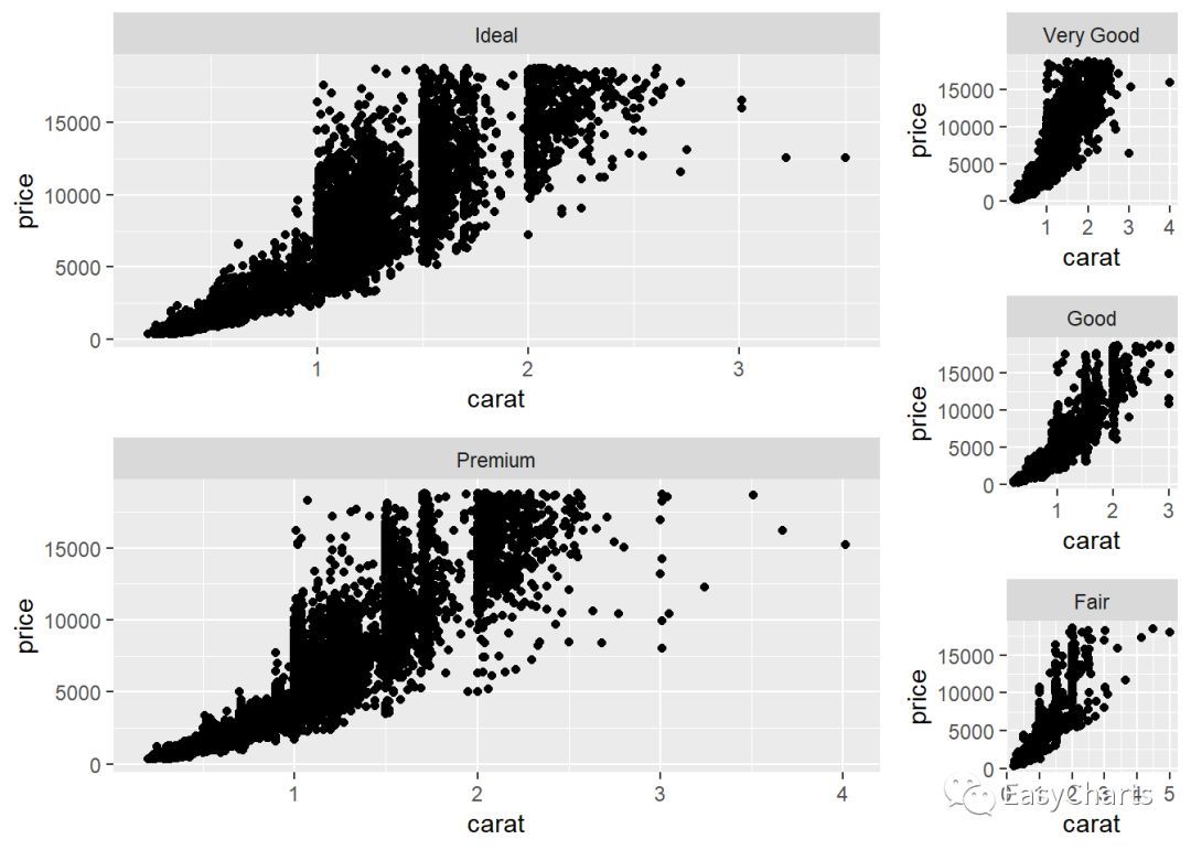
1.5.2 ggplot2绘图对象填充library(ggplot2)
library(customLayout) library(gridExtra)# 创建排版画布 lay1 <-
lay_new(matrix(1:2, ncol = 1)) # 2行1列画布 lay2 <- lay_new(matrix(1:3)) #
3行1列画布 cl <- lay_bind_col(lay1, lay2, widths = c(3, 1)) # 画布列合并#
创建数据cuts <- sort(unique(diamonds[["cut"]]), decreasing = TRUE)
make_cut_plot <- function(cut) { dd <- diamonds[cut ==
diamonds[["cut"]], ] # ggplot(dd) + geom_point(aes(carat, price)) +
facet_wrap("cut") # 封装分面} plots <- lapply(cuts, make_cut_plot) #
对不同切割水平的进行作图 lay_grid(plots, cl) # 将绘图对象依次填充到cl画布中
2cowplot包
cowplot是一个ggplot2包的简单补充,意味着其可以为ggplot2提供出版物级的主题等。
更重要的是,这个包可以组合多个”ggplot2”绘制的图为一个图,并且为每个图加上例如A,B,C等标签,
这在具体的出版物上通常是要求的。 语法结构与ggplot类似,将ggplot2图作为一个对象置于ggdraw()中
表达式:
draw_plot(plot, x = 0, y = 0, width =
1, height = 1, scale = 1) draw_text(text, x = 0.5, y = 0.5, size = 14,
hjust = 0.5, vjust = 0.5,...) draw_plot_label(label, x = 0, y = 1, hjust
= -0.5, vjust = 1.5, size = 16, fontface = "bold", family = NULL,
colour = NULL, ...)
参数解释:
plot 表示ggplot2绘图对象
x, y 表示子图的起点坐标(左下角坐标),在0-1之间,表示占母图的比例,
width, height 表示子图长宽所占比例,在0-1之间
text 表示要映射的文本向量
label 表示要映射的文本向量
其它参数与ggplot2中意思一样
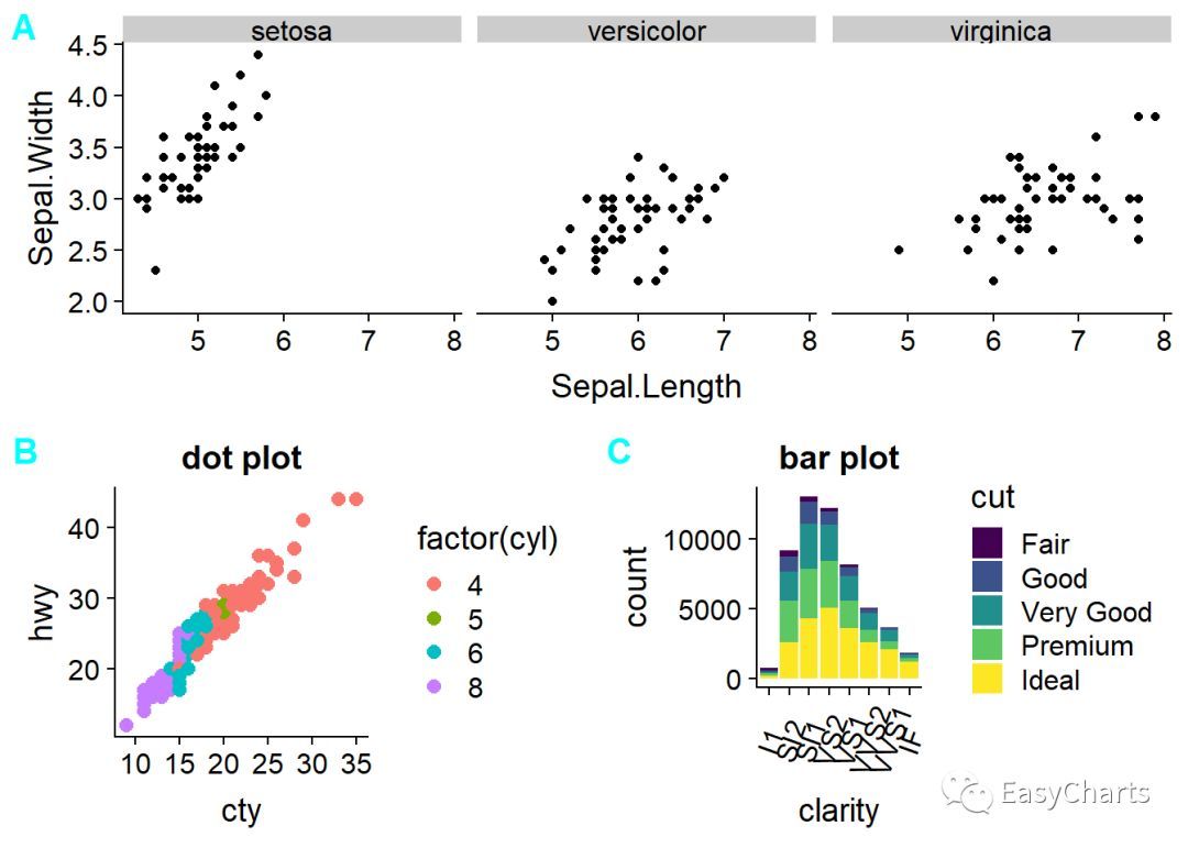
library(ggplot2) library(cowplot)
library(showtext) font_add_google("Dancing ", "Dancing") plot.iris <-
ggplot(iris, aes(Sepal.Length, Sepal.Width)) + geom_point() +
facet_grid(cols = vars(Species)) # 按Species列分面 plot.mpg <-
ggplot(mpg, aes(x = cty, y = hwy, colour = factor(cyl))) +
geom_point(size = 2.5) + labs(title = "dot plot") plot.diamonds <-
ggplot(diamonds, aes(clarity, fill = cut)) + geom_bar() +
theme(axis.text.x = element_text(angle = 70, vjust = 0.5)) + labs(title =
"bar plot") gg <- ggdraw() + draw_plot(plot.iris, 0, 0.5, 1, 0.5) + #
在母图上半部,占母图比例1/2 draw_plot(plot.mpg, 0, 0, 0.5, 0.5) + # 在母图左下角,占母图比例1/4
draw_plot(plot.diamonds, 0.5, 0, 0.5, 0.5) + # 在母图右下角,占母图比例1/4
draw_plot_label(c("A", "B", "C"), c(0, 0, 0.5), c(1, 0.5, 0.5), size =
15, colour = "cyan", family = "Dancing") # 加上标签, showtext_begin()
print(gg) showtext_end()
3 grid 包
grid中文翻译为网格,可将其解释为画布分割,通过设定相应的参数,从而可以任意的摆放图形
常用函数:
grid.newpage() 创建新的画布
grid.layout() 分割画布,使用参数widths和heights指定分割比例 ,从上到下,从左到右排列
viewport() 在画布中创建视窗
grid.show.viewport() 在画布中展示视窗
grid.show.layout() 展示分割的画布
pushViewport() 将新建的viewport推出去,即将工作区域切换到新的viewport
popViewport() 将当前的viewport删除,其父viewport作为新的工作区域, 子viewport中的绘制的图形不会被删除
downViewport() 导航到子viewport,并作为工作区域,原viewport不会删除
upViewport() 导航到父viewport,父viewport变为工作区域, 原viewport不会被删除
seekViewport() 导航到name参数所在的viewport,并作为工作区域
grid.text() 输出文本标签,坐标只与画布有关,与viewport无关
语法:
viewport(x = unit(0.5, "npc"), y =
unit(0.5, "npc"), width = unit(1, "npc"), height = unit(1, "npc"),
default.units = "npc", just = "centre", gp = gpar(), clip = "inherit",
xscale = c(0, 1), yscale = c(0, 1), angle = 0, layout = NULL,
layout.pos.row = NULL, layout.pos.col = NULL, name = NULL)
grid.layout(nrow = 1, ncol = 1, widths = unit(rep_len(1, ncol), "null"),
heights = unit(rep_len(1, nrow), "null"), default.units = "null",
respect = FALSE, just="centre")
参数解释:
name 指定viewport的名字,用于搜索和定位
x,y 为起点坐标,默认是矩形视窗中心坐标,为0 - 1的数字,表示占newpage的比例
width, height 为矩形视窗的长宽,同样是占newpage的比例
angle 表示角度,从-360到360,正数表示逆时针旋转,负数表示顺时针旋转
just 表示指定视窗起点位置,默认“centre”, 还可以设置左下角c(“left”, “buttom”), 右上角c(“right”, “top”) 等
layout grid.layout 对象,用于将当前的viewport拆分为子区域
layout.pos.row 创建的viewport在父节点layout的行位置
layout.pos.col 创建的viewport在父节点的layout列位置
nrow 表示将该区域拆分为几行
ncol 表示将该区域拆分为几列
widths 表示每个子区域的宽度,向量长度等于ncol
heights 表示每个子区域的高度,向量长度等于nrow
gp = gpar() 表示传递其它参数,如: col/fill颜色,lty线型, lwd线宽, fontsize文本尺寸, fontfamily字体, fontface字型等, 可以通过?gpar查询
library(ggplot2) library(grid)
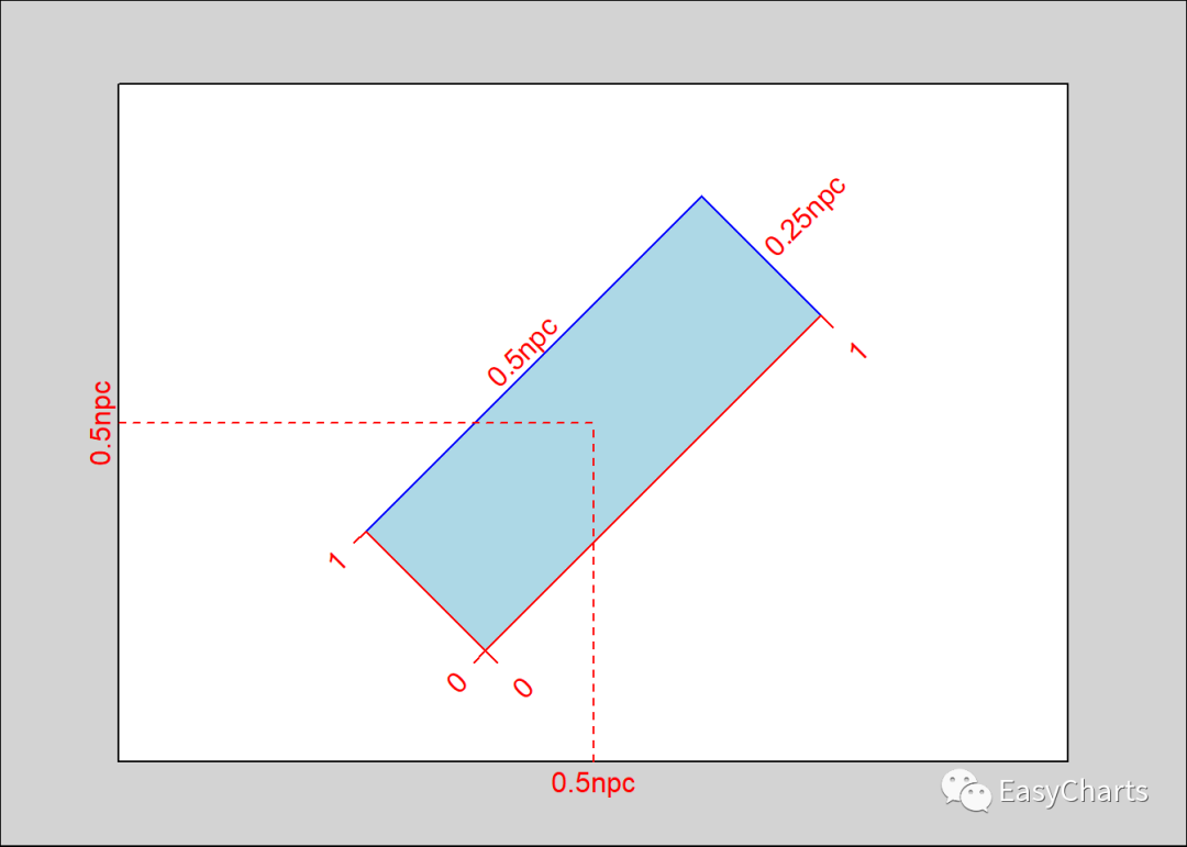
grid.newpage() # 创建一个空白画布 vp1 <- viewport(x = 0.5, y = 0.5, width =
0.5, height = 0.25, angle = 45) # 设定视窗大小 grid.show.viewport(vp1) #
查看在画布中的的视窗,自动上色,方便观察
library(ggplot2) library(grid)
library(showtext) YaHei <- windowsFont("微软雅黑")font_add("YaHei",
regular = "msyh.ttc", bold = "msyhbd.ttc") # 右键字体,然后点击属性,regular指定常规,
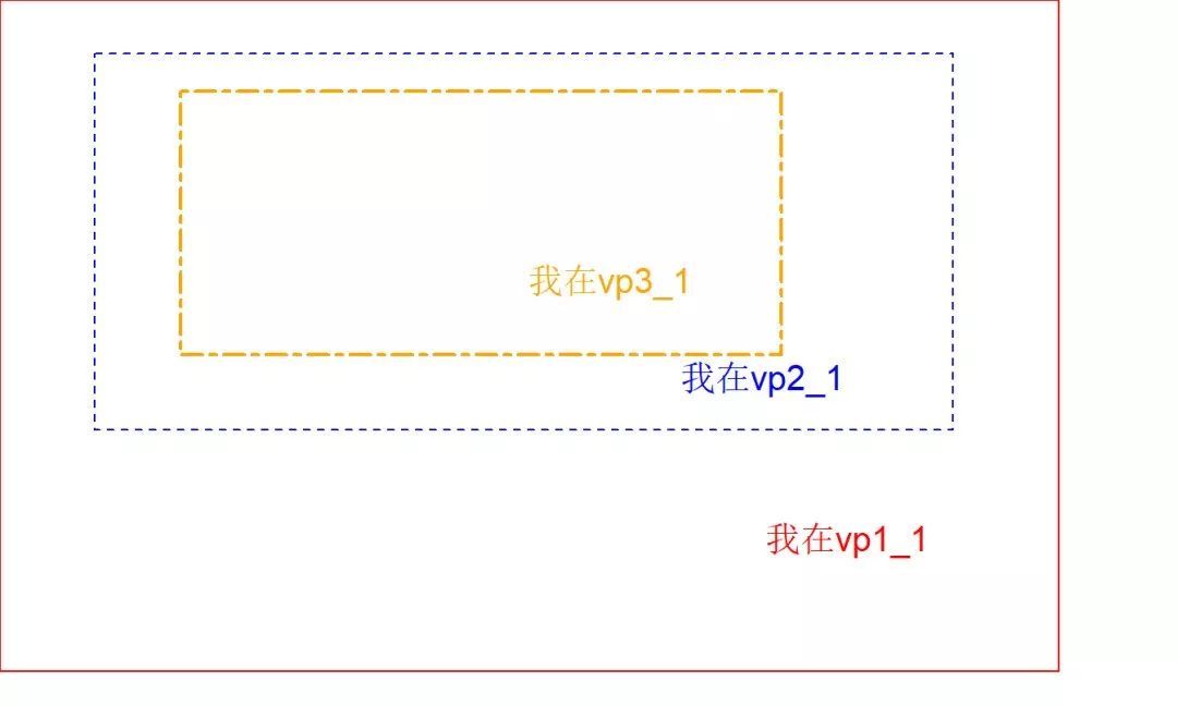
bold表示指定粗体字体 showtext_auto() #### 父viewport grid.newpage() #新建一个page vp1
<- viewport(x = 0, y = 0.2, w = 0.9, h = 0.8, just = c("left",
"bottom")) #新建一个viewport,起点为左下角, pushViewport(vp1) # 推出vp1 grid.rect(gp =
gpar(col = "red")) # 新建一个矩形,gp=gpar()表示设置图形参数 grid.text("我在vp1_1", x =
0.8, y = 0.2, gp = gpar(col = "red", fontfamily = "YaHei", fontsize =
15)) # 新建一个文本,输出到vp1 vp2 <- viewport(x = 0, y = 0.2, w = 0.9, h =
0.8, just = c("left", "bottom")) # 新建一个viewport,起点为左下角,
pushViewport(name = vp2) # 将工作区域设置到vp2 grid.rect(x = 0.1, y = 0.2, width
= 0.9, height = 0.7, just = c("left", "bottom"), gp = gpar(col =
"blue", lty = "dashed")) # 新建一个矩形,gp=gpar()表示设置图形参数 grid.text("我在vp2_1",
x = 0.8, y = 0.3, gp = gpar(col = "blue", fontfamily = "YaHei",
fontsize = 15)) # 新建一个文本,输出到vp2 vp3 <- viewport(x = 0.1, y = 0.2,
width = 0.9, height = 0.7, just = c("left", "bottom")) pushViewport(vp3)
grid.rect(x = 0.1, y = 0.2, width = 0.7, height = 0.7, just = c("left",
"bottom"), gp = gpar(col = "orange", lty = "twodash", lwd = 2)) #
新建一个矩形,gp=gpar()表示设置图形参数 grid.text("我在vp3_1", x = 0.6, y = 0.4, gp =
gpar(col = "orange", fontfamily = "YaHei", fontsize = 15)) #
新建一个文本,输出到vp2
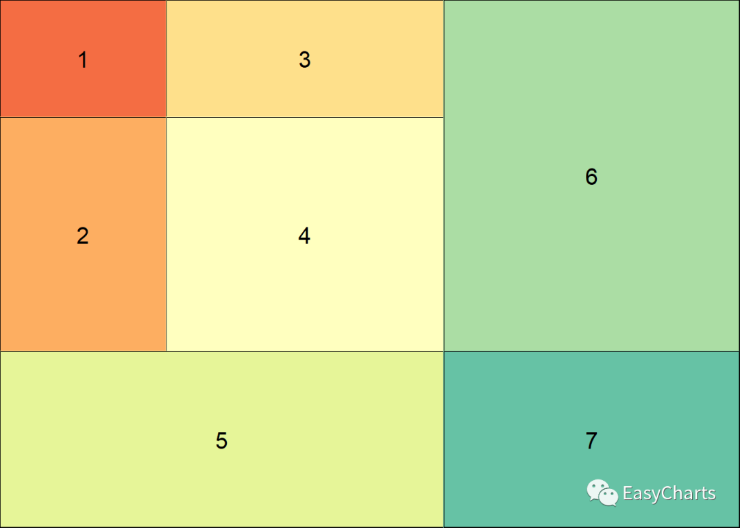
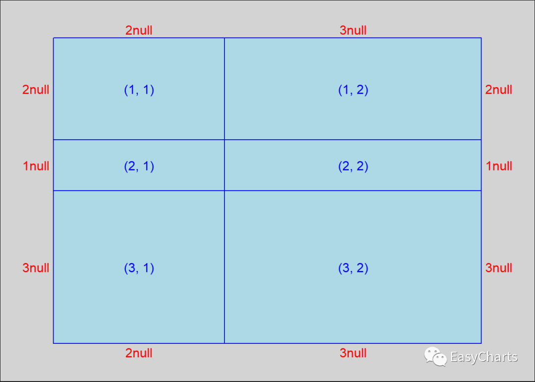
layout参数
library(ggplot2) library(grid)
grid.newpage() g1 <- grid.layout(nrow = 3, ncol = 2, widths = c(2,
3), heights = c(2, 1, 3)) # 设置分割的宽度和长度比例 grid.show.layout(l = g1)
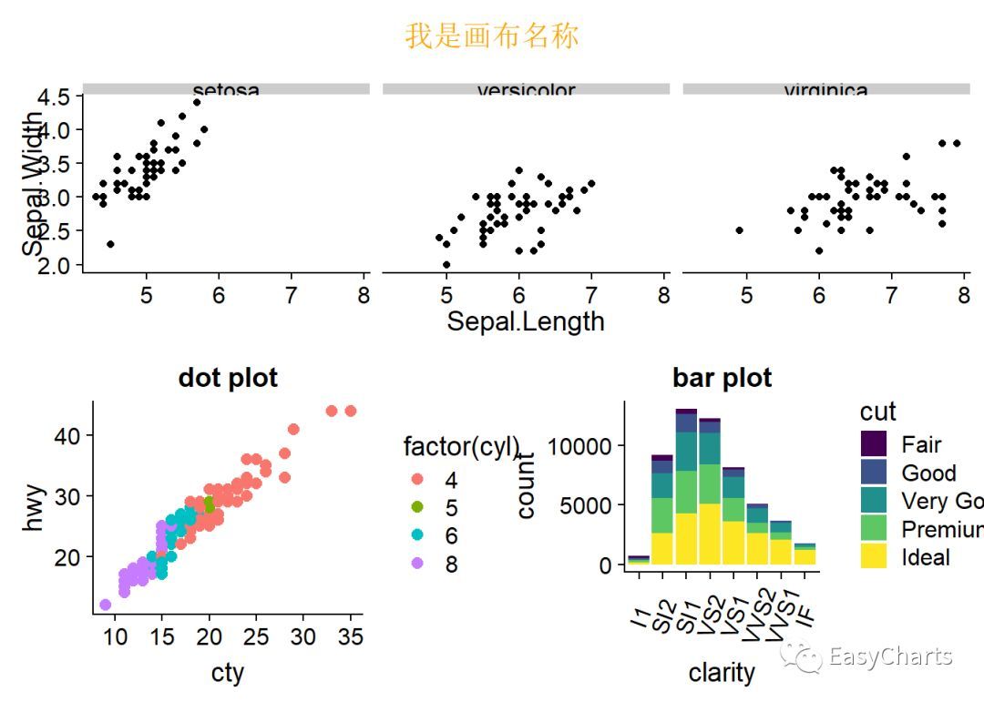
综合例子
library(ggplot2) library(grid)
library(showtext) YaHei <- windowsFont("微软雅黑")font_add("YaHei",
regular = "msyh.ttc", bold = "msyhbd.ttc") # 右键字体,然后点击属性,regular指定常规,
bold表示指定粗体字体 showtext_auto() plot.iris <- ggplot(iris,
aes(Sepal.Length, Sepal.Width)) + geom_point() + facet_grid(cols =
vars(Species)) # 按Species列分面 plot.mpg <- ggplot(mpg, aes(x = cty, y =
hwy, colour = factor(cyl))) + geom_point(size = 2.5) + labs(title =
"dot plot") plot.diamonds <- ggplot(diamonds, aes(clarity, fill =
cut)) + geom_bar() + theme(axis.text.x = element_text(angle = 70, vjust =
0.5)) + labs(title = "bar plot") grid.newpage() # 新建画布 layout_1 <-
grid.layout(nrow = 3, ncol = 2, widths = c(1, 1), heights = c(1, 4, 5)) #
分成上下2*3共6个版块,最上面版块显示标题 pushViewport(viewport(layout = layout_1)) #
推出分成6个版块的视窗 print(plot.iris, vp = viewport(layout.pos.row = 2,
layout.pos.col = c(1, 2))) # 在中间一行子视窗中画plot.iris print(plot.mpg, vp =
viewport(layout.pos.row = 3, layout.pos.col = 1)) # 在左下角子视窗中画plot.mpg
print(plot.diamonds, vp = viewport(layout.pos.row = 3, layout.pos.col =
2)) #在右下角子视窗中画plot.diamonds grid.text("我是画布名称", x = 0.5, y = 0.95, gp =
gpar(col = "orange", fontfamily = "YaHei", fontsize = 15)) # 增加画布标题
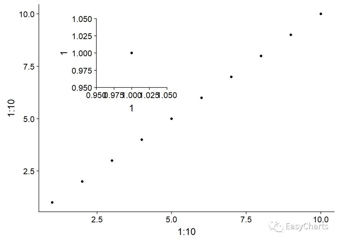
3.1 子母图
字母图,主要是形成局部放大的效果,既可以从整体上对比,又兼顾特别小的数据组,或特别密的数据点可以查看,而没有必要单独做2张图
library(ggplot2)library(grid)3.2 grid 拼接蝴蝶图library(ggplot2)
library(grid) library(dplyr) library(showtext) library(Cairo) YaHei
<- windowsFont("微软雅黑") font_add("YaHei",regular = "msyh.ttc", bold =
"msyhbd.ttc") # 右键字体,然后点击属性,regular指定常规, bold表示指定粗体字体 CairoPNG(file =
"E:/R_input&output/images_output/蝴蝶图_exercing.png", width = 1200,
height = 700) showtext_begin()#生成图形所需数据集: mydata<-data.frame(id=1:14,
A=c(5.0,14.7,2.5,8.5,5.1,6.9,7.7,6.8,4.4,4.9,5.3,1.0,0.9,7.8),
B=c(31.3,24.7,17.8,17.2,15.3,14.3,13.9,13.9,12.4,10.0,6.5,4.2,2.5,0.9),
Label=c("Website","Customer & Employee
Referral","Webinar","Facebook/Twitter/Other Social","Marketting &
Advertising","Paid Serch","Other","Sales
generated","Tradeshows","Parter","Linkedin","Events","Lead list","Emial
Campaign")) p1<-ggplot(mydata) + # 绘制右侧的柱形图
geom_hline(yintercept=mean(mydata$A),linetype=2,size=.25,colour="grey")+
geom_bar(aes(x=id,y=A),stat="identity",fill="#E2BB1E",colour=NA)+
ylim(-5.5,16)+ scale_x_reverse()+
geom_text(aes(x=id,y=-4,label=Label),vjust=.5)+
geom_text(aes(x=id,y=A+.75,label=paste0(A,"%")),size=4.5,family="YaHei",fontface="bold")+
coord_flip()+ theme_void() p1
p2<-ggplot(mydata)+ # 绘制左侧柱形图,
左侧图没有横坐标刻度标签
geom_hline(yintercept=-mean(mydata$B),linetype=2,size=.25,colour="grey")+
geom_bar(aes(x=id,y=-B),stat="identity",fill="#C44E4C",colour=NA)+ #
y=-B,绘制的图形在另一侧 ylim(-40,0)+ scale_x_reverse()+ #
geom_text(aes(x=id,y=-B-1.75,label=paste0(B,"%")),size=4.5,family="YaHei",fontface="bold")+
coord_flip()+ theme_void() p2#
图形拼接 grid.newpage() # 新建画布 layout_1 <- grid.layout(nrow = 2, ncol =
2, widths = c(2, 3), heights = c(1, 9)) # 分成2*2共4个版块
pushViewport(viewport(layout = layout_1)) # 推出分为4个版块的视窗 print(p1, vp =
viewport(layout.pos.row = 2, layout.pos.col = 2)) # 将p1输出到右下角 print(p2,
vp = viewport(layout.pos.row = 2, layout.pos.col = 1)) # 将p2输出到左下角#
添加主标题和分标题 grid.text(label="我是主标题",x = 0.5,y =
0.97,gp=gpar(col="cyan",fontsize=15,fontfamily="YaHei",draw=TRUE,just =
"centre")) grid.text(label="我是左标题", x = 0.15,y
=0.94,gp=gpar(col="blue",fontsize=10,fontfamily="YaHei",draw=TRUE,just =
c("left", "top"))) grid.text(label="我是右标题",x = 0.85,y
=0.94,gp=gpar(col="blue",fontsize=10,fontfamily="YaHei",draw=TRUE,just =
c("right", "top")))
showtext_end()dev.off() ## png ## 2
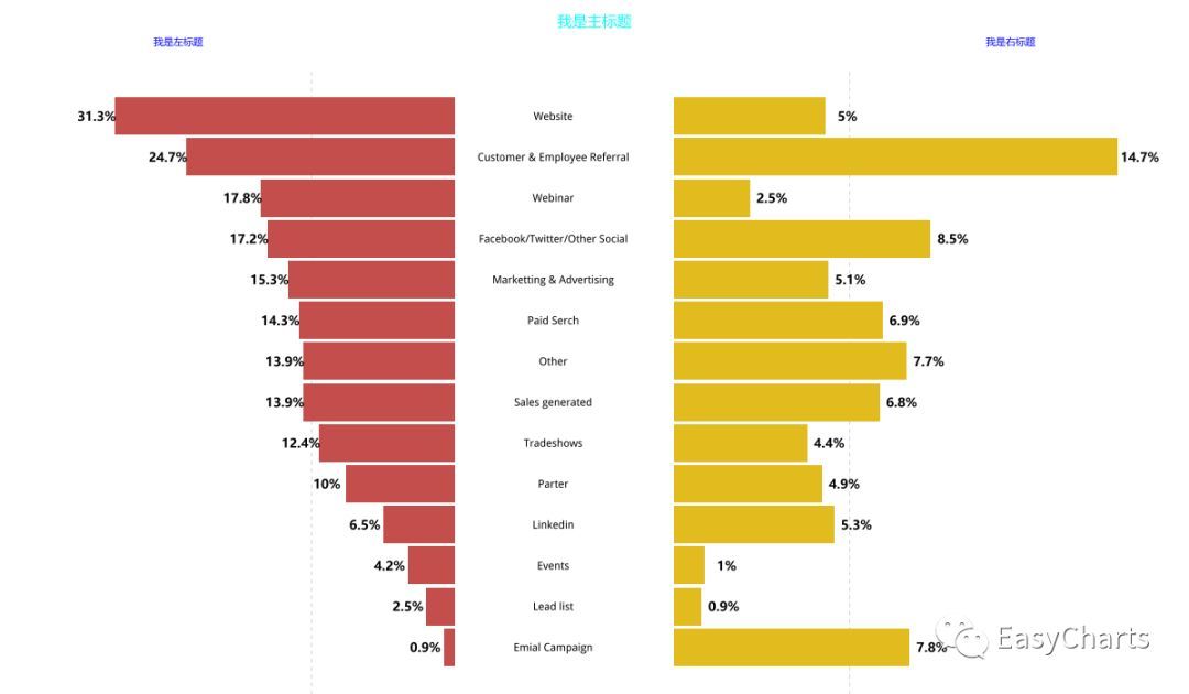
蝴蝶图
4gridExtra包
主要函数:
arrangeGrob()
grid.arrange()
marrangeGrob()
语法:
arrangeGrob(..., grobs = list(...),
layout_matrix, vp = NULL, name = "arrange", as.table = TRUE, respect =
FALSE, clip = "off", nrow = NULL, ncol = NULL, widths = NULL, heights =
NULL, top = NULL, bottom = NULL, left = NULL, right = NULL, padding =
unit(0.5, "line")) grid.arrange(..., newpage = TRUE) marrangeGrob(grobs,
..., ncol, nrow, layout_matrix = matrix(seq_len(nrow * ncol), nrow =
nrow, ncol = ncol), top = quote(paste("page", g, "of", npages)))
参数解释:
grobs 图形对象列表,grob是graphical object两个单词的缩写,表示ggpot等图形对象
layout_matrix 表示布局的矩阵
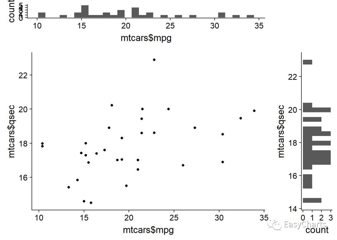
library(ggplot2) library(gridExtra)
library(showtext) YaHei <- windowsFont("微软雅黑")
font_add("YaHei",regular = "msyh.ttc", bold = "msyhbd.ttc") #
右键字体,然后点击属性,regular指定常规, bold表示指定粗体字体 showtext.auto() empty <-
ggplot() + geom_point(aes(1, 1), colour = "white") + theme(axis.ticks =
element_blank(), panel.background = element_blank(), axis.line =
element_blank(), axis.text.x = element_blank(), axis.text.y =
element_blank(), axis.title.x = element_blank(), axis.title.y =
element_blank()) scatter <- ggplot() + geom_point(aes(mtcars$mpg,
mtcars$qsec)) # 绘制主图散点图 hist_top <- ggplot() +
geom_histogram(aes(mtcars$mpg)) # 绘制上方频率分布直方图 hist_right <- ggplot() +
geom_histogram(aes(mtcars$qsec)) + coord_flip() # 绘制右侧频率分布直方图#
最终组合,由4个图拼图而成,只有右上角的图已经将标注移除了 grid.arrange(hist_top, empty, scatter,
hist_right, # 按从左到右,从上到下顺序排列4个图ncol = 2, nrow = 2, widths = c(4, 1),
heights = c(1, 4)) # 4个版块的长宽比例# 其实这种组合图已经有相应的R包了,ggExtra# df <-
data.frame(x = mtcars$mpg, y = mtcars$qsec)# p <- ggplot(df, aes(x,
y)) + geom_point() + theme_classic()# ggExtra::ggMarginal(p, type =
"histogram")
把绘图对象添加到列表总,并把该列表传递给grid.arrange()函数中的grobs参数
library(ggplot2) library(gridExtra)
library(lattice) # 类似ggplot,但是语法更加复杂 library(showtext) YaHei <-
windowsFont("微软雅黑") font_add("YaHei", regular = "msyh.ttc", bold =
"msyhbd.ttc") # 右键字体,然后点击属性,regular指定常规, bold表示指定粗体字体 showtext.auto() gs
<- list(NULL) gs[[1]] <- qplot(1, 1) gs[[2]] <- xyplot(1 ~ 1) #
lattice包 grid.arrange(grobs = gs, ncol = 2)
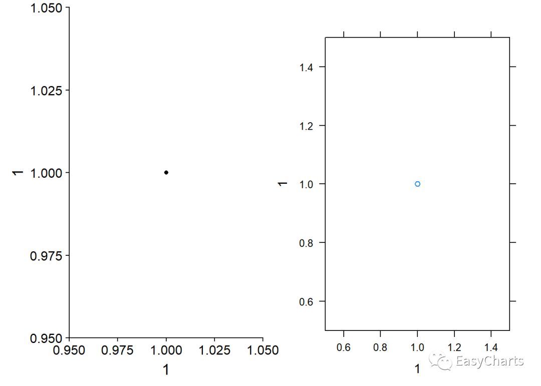
子母图
grid包可以画字母图安装gridExtra包后,ggplot2中多了一个ggplotGrob()函数,可以创建grob对象参数:
library(ggplot2) library(gridExtra) g
<- ggplotGrob(qplot(1, 1) + theme(plot.background =
element_rect(colour = "black"))) qplot(1:10, 1:10) + annotation_custom( #
通过添加注释的方式,向图形内部添加一个图形 grob = g, # 插入图形对象,即添加内容 xmin = 1, xmax = 5, ymin
= 5, ymax = 10 # 添加位置4个坐标 )
转载自公众号:EasyCharts