什么类型的可视化用于什么类型的问题?本文可帮助您为特定分析目标选择正确的图表类型,以及如何使用ggplot2在R中实现它。
一个有效的图标:
在不歪曲事实的情况下传达正确的信息
简单而优雅的表达信息内容
通过美学表达信息,而不是掩盖信息
没有信息负载
下面介绍了八类常见的图表可视化情景。在绘图之前,请仔细考虑你准备如何通过可视化的方式表达统计事实或事件关系。也许就是这八类情景中的一个。
类型一:相关性
以及几个图用于检查两个变量见的相关性
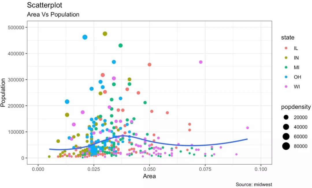
散点图
散点图是数据分析过程中使用最多的图标之一。当你想了解两个变量间的相关性时,首先想到的就是散点图。
我们可以用ggplot2里的geom_point()绘制散点图。另外,还可以用geom_smooth来绘制平滑曲线,通过设置methon='lm'来绘制最佳拟合曲线。
options(scipen=999)
library(ggplot2)
theme_set(theme_bw())
data("midwest", package = "ggplot2")
# midwest <- read.csv("http://goo.gl/G1K41K")
# Scatterplot
gg <- ggplot(midwest, aes(x=area, y=poptotal)) +
geom_point(aes(col=state, size=popdensity)) +
geom_smooth(method="loess", se=F) +
xlim(c(0, 0.1)) +
ylim(c(0, 500000)) +
labs(subtitle="Area Vs Population",
y="Population",
x="Area",
title="Scatterplot",
caption = "Source: midwest")
plot(gg)
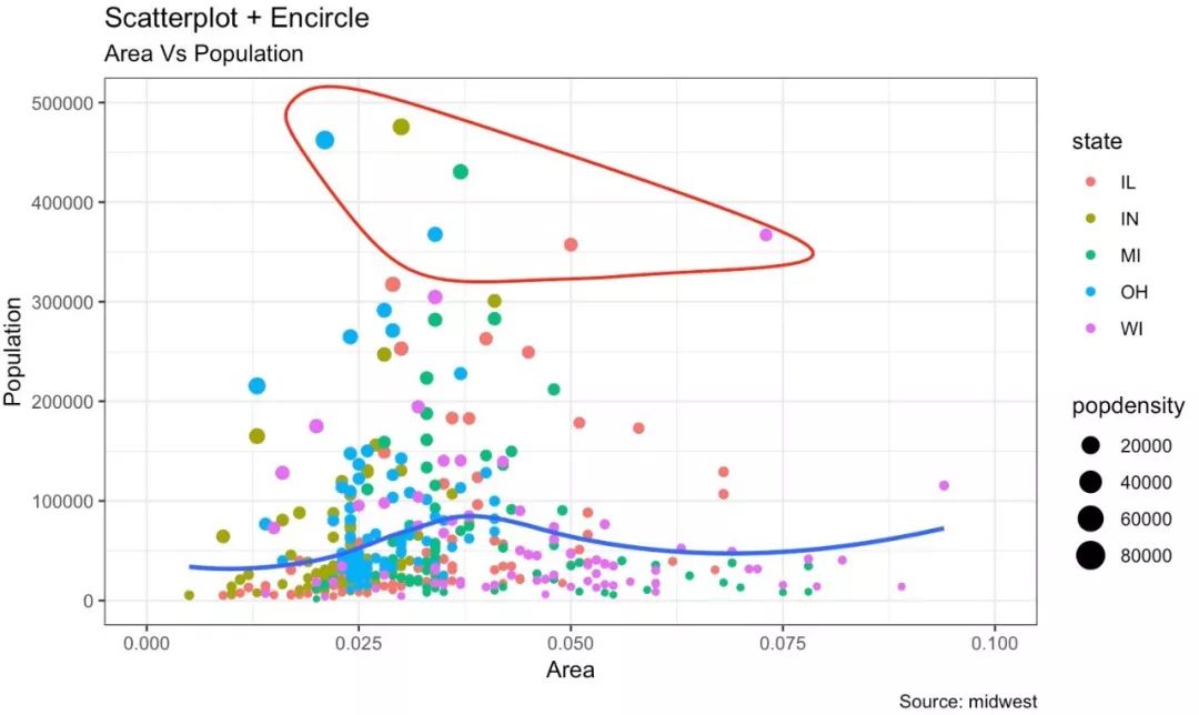
带有环绕的散点图
在展示结果时,有时可以将某个特殊的区域包围起来,从而达到突出展示的效果。
我们可以通过ggalt包里的geom_encircle()实现。
在geom_encircle()中,我们可以指定需要突出的数据集,此外还可以扩展曲线,以便在点之外传递;以及修改曲线的颜色及大小。
# install 'ggalt' pkg
# devtools::install_github("hrbrmstr/ggalt")
options(scipen = 999)
library(ggplot2)
library(ggalt)
midwest_select <- midwest[midwest$poptotal > 350000 &
midwest$poptotal <= 500000 &
midwest$area > 0.01 &
midwest$area < 0.1, ]
# Plot
ggplot(midwest, aes(x=area, y=poptotal)) +
geom_point(aes(col=state, size=popdensity)) + # draw points
geom_smooth(method="loess", se=F) +
xlim(c(0, 0.1)) +
ylim(c(0, 500000)) + # draw smoothing line
geom_encircle(aes(x=area, y=poptotal),
data=midwest_select,
color="red",
size=2,
expand=0.08) + # encircle
labs(subtitle="Area Vs Population",
y="Population",
x="Area",
title="Scatterplot + Encircle",
caption="Source: midwest")
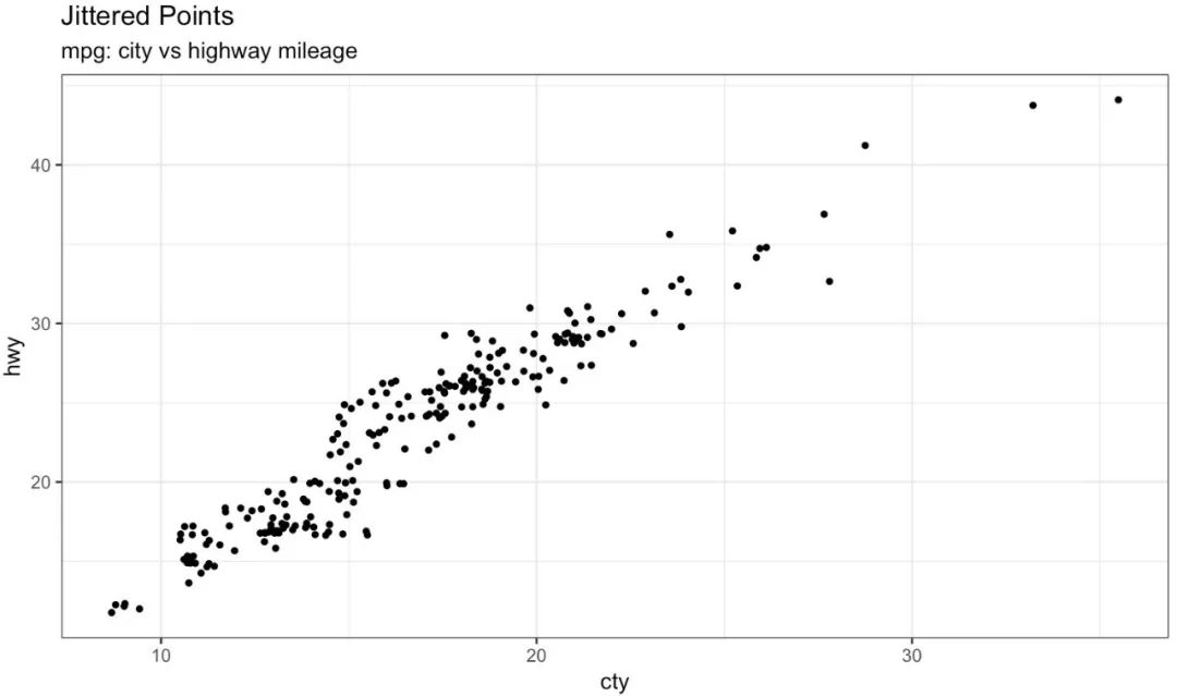
Jitter图
我们看看先用一组新的数据绘制散点图。这次,我将使用mpg数据集来绘制城市里程(cty)与公路里程。
# load package and data
library(ggplot2)
data(mpg, package="ggplot2")
# alternate source: "http://goo.gl/uEeRGu")
theme_set(theme_bw()) # pre-set the bw theme.
g <- ggplot(mpg, aes(cty, hwy))
# Scatterplot
g + geom_point() +
geom_smooth(method="lm", se=F) +
labs(subtitle="mpg: city vs highway mileage",
y="hwy",
x="cty",
title="Scatterplot with overlapping points",
caption="Source: midwest")
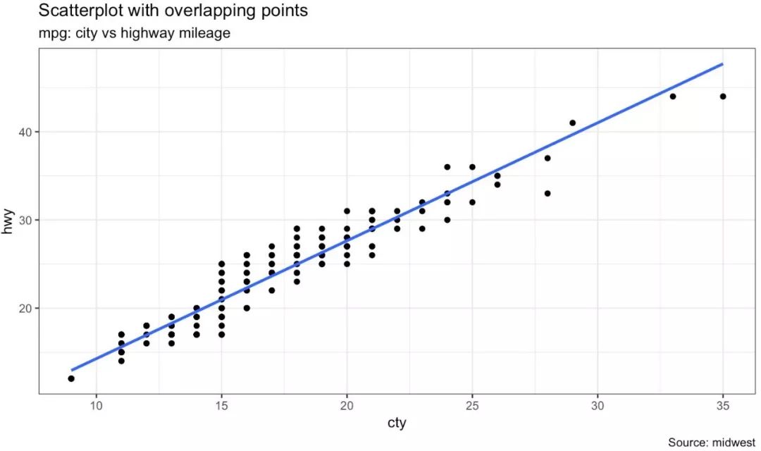
虽然我们能够从图中看出,两个变量存在相关性。但是不难发现,很多散点被隐藏了,因为数据存在重叠的问题。由于cty和hvy两个变量都是整数,所以数据重叠的现象更加严重。对于这类数据集的散点图,展示过程中应该格外小心。
那么应该如何解决一个问题呢?我们可以使用jitter_geom()对数据增加抖动,通过设置wigth,使得重叠的点在原始位置随机抖动。
# load package and data
library(ggplot2)
data(mpg, package="ggplot2")
# mpg <- read.csv("http://goo.gl/uEeRGu")
# Scatterplot
theme_set(theme_bw()) # pre-set the bw theme.
g <- ggplot(mpg, aes(cty, hwy))
g + geom_jitter(width = .5, size=1) +
labs(subtitle="mpg: city vs highway mileage",
y="hwy",
x="cty",
title="Jittered Points")
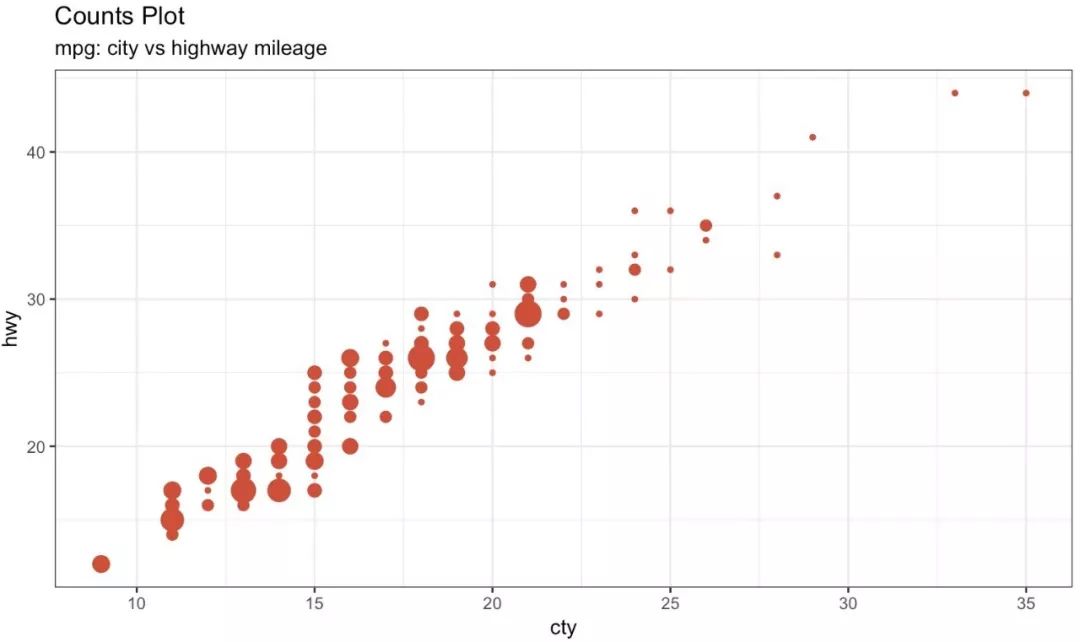
计数图
第二种解决散点重叠的方法是使用计数图。当数据存在散点重叠时,我们可以用散点大小来表达数据重叠的程度。
# load package and data
library(ggplot2)
data(mpg, package="ggplot2")
# mpg <- read.csv("http://goo.gl/uEeRGu")
# Scatterplot
theme_set(theme_bw()) # pre-set the bw theme.
g <- ggplot(mpg, aes(cty, hwy))
g + geom_count(col="tomato3", show.legend=F) +
labs(subtitle="mpg: city vs highway mileage",
y="hwy",
x="cty",
title="Counts Plot")
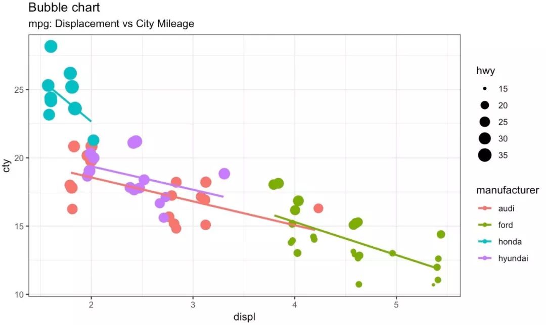
气泡图
虽然散点图能够表示两个连续变量间的相关关系。但如果想在以下两个方面了解数据间的潜在关系时,气泡图会更有用:
1.基于分类变量,修改散点颜色
2.基于另一个连续变量,表示散点的大小
简单来说,如果你有一个四维变量的数据,两个连续变量,一个分类变量用以表示颜色,一个连续变量表示点的大小,那么气泡图就非常适合了。
比如下面这个例子,气泡图清楚地区分了制造商之间的差异以及最佳拟合曲线的斜率变化,从而能够更好的比较不同组群间的差异。
# load package and data
library(ggplot2)
data(mpg, package="ggplot2")
# mpg <- read.csv("http://goo.gl/uEeRGu")
mpg_select <- mpg[mpg$manufacturer %in% c("audi", "ford", "honda", "hyundai"), ]
# Scatterplot
theme_set(theme_bw()) # pre-set the bw theme.
g <- ggplot(mpg_select, aes(displ, cty)) +
labs(subtitle="mpg: Displacement vs City Mileage",
title="Bubble chart")
g + geom_jitter(aes(col=manufacturer, size=hwy)) +
geom_smooth(aes(col=manufacturer), method="lm", se=F)
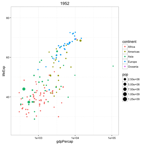
动态气泡图
对于动态气泡图的实现,可以使用gganimate包。动态气泡图和普通气泡图的区别就在于使用第五维数据(一般是时间)来展示数据间的变化。
动态气泡图的处理方法和其它图形基本一致,不同的是需要在aes层指定动画展示的变量。构建绘图后,可以使用gganimate()通过设置动画的时间间隔。
# Source: https://github.com/dgrtwo/gganimate
# install.packages("cowplot") # a gganimate dependency
# devtools::install_github("dgrtwo/gganimate")
library(ggplot2)
library(gganimate)
library(gapminder)
theme_set(theme_bw()) # pre-set the bw theme.
g <- ggplot(gapminder, aes(gdpPercap, lifeExp, size = pop,
frame = year)) +
geom_point() +
geom_smooth(aes(group = year),
method = "lm",
show.legend = FALSE) +
facet_wrap(~continent, scales = "free") +
scale_x_log10() # convert to log scale
gganimate(g, interval=0.2)
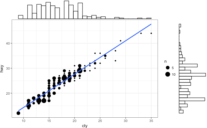
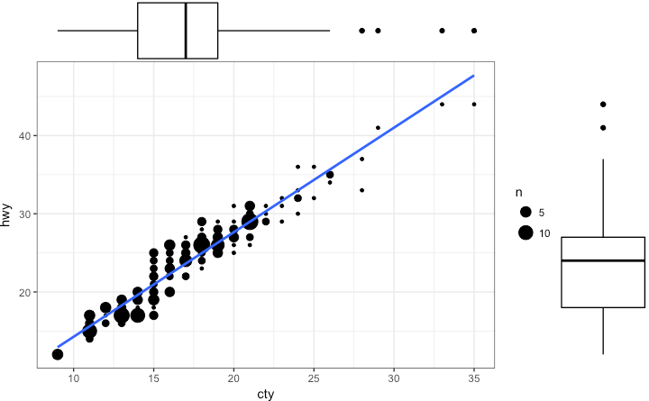
边缘分布的直方图/箱型图
如果你想在用一张图表中显示两个变量的关系以及分布,那么可以使用边缘分布直方图。它可以在散点图的X、Y周,显示变量的直方图。
边缘分布直方图可以通过ggExtra包的ggMarginal()函数实现。除了绘制直方图外,还支持绘制边缘分布的箱型图和密度函数。
# load package and data
library(ggplot2)
library(ggExtra)
data(mpg, package="ggplot2")
# mpg <- read.csv("http://goo.gl/uEeRGu")
# Scatterplot
theme_set(theme_bw()) # pre-set the bw theme.
mpg_select <- mpg[mpg$hwy >= 35 & mpg$cty > 27, ]
g <- ggplot(mpg, aes(cty, hwy)) +
geom_count() +
geom_smooth(method="lm", se=F)
ggMarginal(g, type = "histogram", fill="transparent")
ggMarginal(g, type = "boxplot", fill="transparent")
# ggMarginal(g, type = "density", fill="transparent")
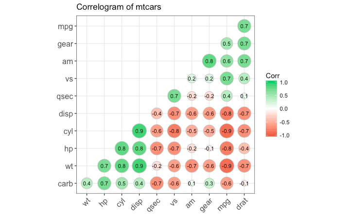
相关关系图
相关关系图可以同时显示统一组数据中多个变量间的相关性。通过ggcorrplot包可以很方便的实现它。
# devtools::install_github("kassambara/ggcorrplot")
library(ggplot2)
library(ggcorrplot)
# Correlation matrix
data(mtcars)
corr <- round(cor(mtcars), 1)
# Plot
ggcorrplot(corr, hc.order = TRUE,
type = "lower",
lab = TRUE,
lab_size = 3,
method="circle",
colors = c("tomato2", "white", "springgreen3"),
title="Correlogram of mtcars",
ggtheme=theme_bw)
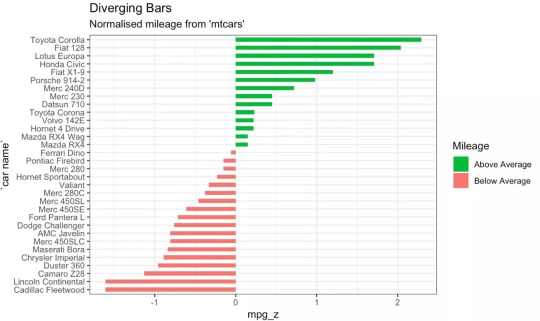
类型二: 偏差 条形图
条形图,是一种可以同时处理正负值的条形图表。一般通过geombar()函数就能实现,但是使用geombar()函数时,往往会出现概念上的混淆。因为该函数既可以画直方图也可以画条形图。
比如,geom_bar()函数的stat参数默认值是count,这也意味着,当指定的数据是连续变量时,系统会生成直方图。为了创建条形图而不是直方图,需要作如下修改:
设置参数stat=identity
在aes()中提供x和y两维变量,其中x是字符或因子型变量,y是数值型变量
在下面的示例中,首先对mtcars数据集的mpg进行标准化。将那些mpg大于零的车辆标记为绿色,小于零的车辆标记为红色。
library(ggplot2)
theme_set(theme_bw())
# Data Prep
data("mtcars") # load data
mtcars$`car name` <- rownames(mtcars)
mtcars$mpg_z <- round((mtcars$mpg - mean(mtcars$mpg))/sd(mtcars$mpg), 2)
mtcars$mpg_type <- ifelse(mtcars$mpg_z < 0, "below", "above")
mtcars <- mtcars[order(mtcars$mpg_z), ] # sort
mtcars$`car name` <- factor(mtcars$`car name`,
levels = mtcars$`car name`)
#Diverging Barcharts
ggplot(mtcars, aes(x=`car name`, y=mpg_z, label=mpg_z)) +
geom_bar(stat='identity', aes(fill=mpg_type), width=.5) +
scale_fill_manual(name="Mileage",
labels = c("Above Average", "Below Average"),
values = c("above"="#00ba38", "below"="#f8766d")) +
labs(subtitle="Normalised mileage from 'mtcars'",
title= "Diverging Bars") +
coord_flip()
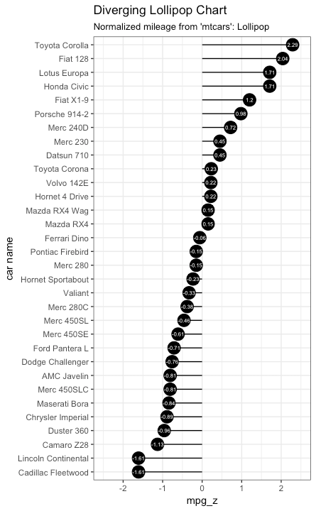
棒棒糖图
棒棒糖图与条形图类似。一般可以使用geom_point()和geom_segment()来画棒棒糖图。借用条形图的数据,我们这里用棒棒糖图来实现它。
library(ggplot2)
theme_set(theme_bw())
ggplot(mtcars, aes(x=`car name`, y=mpg_z, label=mpg_z)) +
geom_point(stat='identity', fill="black", size=6) +
geom_segment(aes(y = 0,
x = `car name`,
yend = mpg_z,
xend = `car name`),
color = "black") +
geom_text(color="white", size=2) +
labs(title="Diverging Lollipop Chart",
subtitle="Normalized mileage from 'mtcars': Lollipop") +
ylim(-2.5, 2.5) +
coord_flip()
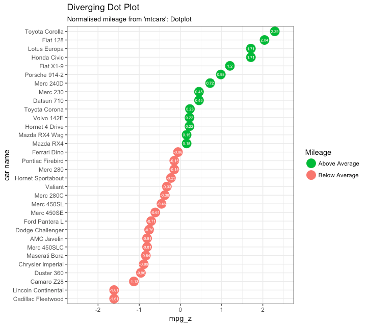
点图
点图与条形图原理一致,只是表达形式不同。
library(ggplot2)
theme_set(theme_bw())
# Plot
ggplot(mtcars, aes(x=`car name`, y=mpg_z, label=mpg_z)) +
geom_point(stat='identity', aes(col=mpg_type), size=6) +
scale_color_manual(name="Mileage",
labels = c("Above Average", "Below Average"),
values = c("above"="#00ba38", "below"="#f8766d")) +
geom_text(color="white", size=2) +
labs(title="Diverging Dot Plot",
subtitle="Normalized mileage from 'mtcars': Dotplot") +
ylim(-2.5, 2.5) +
coord_flip()
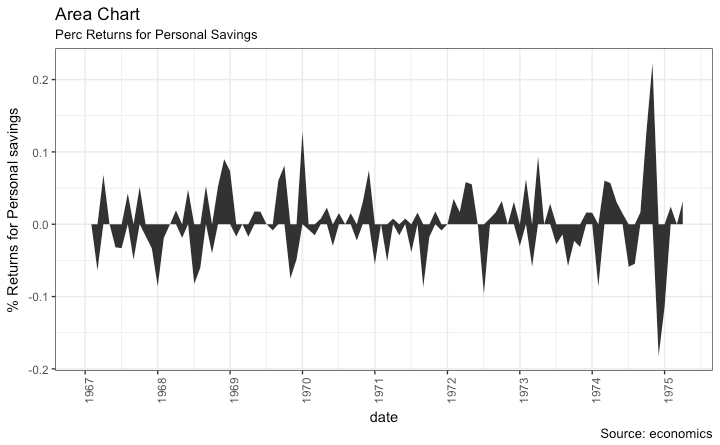
面积图
面积图一般用来表示某指标与基准指标相比的变化情况。通常可以用geom_area()函数实现它。
library(ggplot2)
library(quantmod)
data("economics", package = "ggplot2")
# Compute % Returns
economics$returns_perc <- c(0, diff(economics$psavert)/
economics$psavert[-length(economics$psavert)])
# Create break points and labels for axis ticks
brks <- economics$date[seq(1, length(economics$date), 12)]
lbls <- lubridate::year(economics$date[seq(1,
length(economics$date), 12)])
# Plot
ggplot(economics[1:100, ], aes(date, returns_perc)) +
geom_area() +
scale_x_date(breaks=brks, labels=lbls) +
theme(axis.text.x = element_text(angle=90)) +
labs(title="Area Chart",
subtitle = "Perc Returns for Personal Savings",
y="% Returns for Personal savings",
caption="Source: economics")
类型三: 排序
排序图一般用于比较多个项目之间的指标大小。
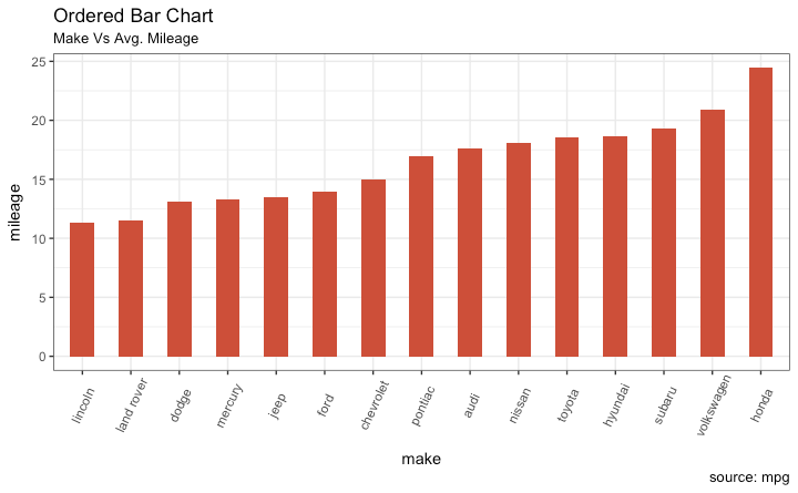
有序条形图
有序条形图是按照Y轴变量大小进行排序的条形图。让我们用mpg数据集绘制每个制造商的平均城市里程数的有序条形图。
cty_mpg <- aggregate(mpg$cty, by=list(mpg$manufacturer), FUN=mean)
colnames(cty_mpg) <- c("make", "mileage")
cty_mpg <- cty_mpg[order(cty_mpg$mileage), ]
cty_mpg$make <- factor(cty_mpg$make, levels = cty_mpg$make)
library(ggplot2)
theme_set(theme_bw())
# Draw plot
ggplot(cty_mpg, aes(x=make, y=mileage)) +
geom_bar(stat="identity", width=.5, fill="tomato3") +
labs(title="Ordered Bar Chart",
subtitle="Make Vs Avg. Mileage",
caption="source: mpg") +
theme(axis.text.x = element_text(angle=65, vjust=0.6))
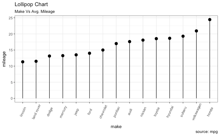
棒棒糖图
与条形图类似,棒棒糖图也具备类似的图形展示效果。通过将条形改为细线,可以让图形显得更简洁,更美观。
library(ggplot2)
theme_set(theme_bw())
# Plot
ggplot(cty_mpg, aes(x=make, y=mileage)) +
geom_point(size=3) +
geom_segment(aes(x=make,
xend=make,
y=0,
yend=mileage)) +
labs(title="Lollipop Chart",
subtitle="Make Vs Avg. Mileage",
caption="source: mpg") +
theme(axis.text.x = element_text(angle=65, vjust=0.6))
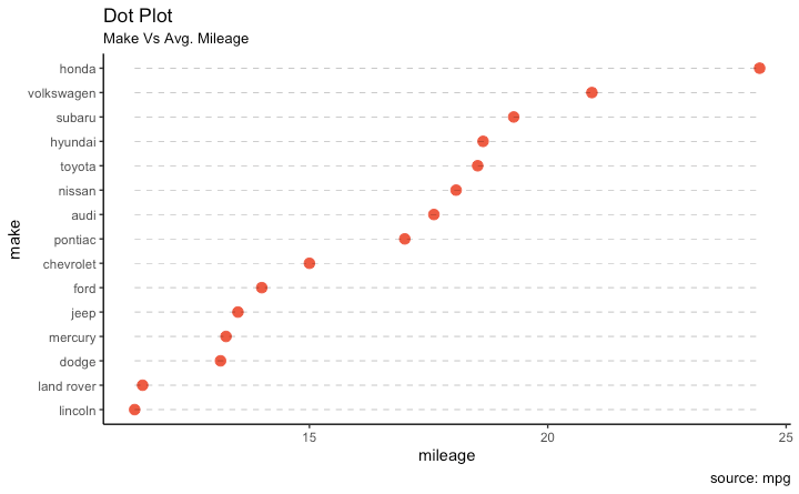
点图
点图其实和棒棒糖图类似,但是没有线条,并且指标被反转到了X轴。
library(ggplot2)
library(scales)
theme_set(theme_classic())
# Plot
ggplot(cty_mpg, aes(x=make, y=mileage)) +
geom_point(col="tomato2", size=3) + # Draw points
geom_segment(aes(x=make,
xend=make,
y=min(mileage),
yend=max(mileage)),
linetype="dashed",
size=0.1) + # Draw dashed lines
labs(title="Dot Plot",
subtitle="Make Vs Avg. Mileage",
caption="source: mpg") +
coord_flip()
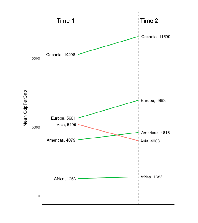
倾斜图
斜率图是比较2个时间点之间位置的绝佳方法,既能展示值的大小变化,也能同时展示排名的变化。下图可以作为倾斜图的一个展示。
library(ggplot2)
library(scales)
theme_set(theme_classic())
# prep data
df <- read.csv("https://raw.githubusercontent.com/
selva86/datasets/master/gdppercap.csv")
colnames(df) <- c("continent", "1952", "1957")
left_label <- paste(df$continent, round(df$`1952`),sep=", ")
right_label <- paste(df$continent, round(df$`1957`),sep=", ")
df$class <- ifelse((df$`1957` - df$`1952`) < 0, "red", "green")
# Plot
p <- ggplot(df) +
geom_segment(aes(x=1, xend=2,
y=`1952`, yend=`1957`,
col=class), size=.75,
show.legend=F) +
geom_vline(xintercept=1, linetype="dashed", size=.1) +
geom_vline(xintercept=2, linetype="dashed", size=.1) +
scale_color_manual(labels = c("Up", "Down"),
values = c("green"="#00ba38",
"red"="#f8766d")) +
labs(x="", y="Mean GdpPerCap") +
xlim(.5, 2.5) + ylim(0,(1.1*(max(df$`1952`, df$`1957`))))
# Add texts
p <- p + geom_text(label=left_label, y=df$`1952`,
x=rep(1, NROW(df)), hjust=1.1, size=3.5)
p <- p + geom_text(label=right_label, y=df$`1957`,
x=rep(2, NROW(df)), hjust=-0.1, size=3.5)
p <- p + geom_text(label="Time 1", x=1, y=1.1*(max(df$`1952`,
df$`1957`)), hjust=1.2, size=5)
p <- p + geom_text(label="Time 2", x=2, y=1.1*(max(df$`1952`,
df$`1957`)), hjust=-0.1, size=5)
# Minify theme
p + theme(panel.background = element_blank(),
panel.grid = element_blank(),
axis.ticks = element_blank(),
axis.text.x = element_blank(),
panel.border = element_blank(),
plot.margin = unit(c(1,2,1,2), "cm"))
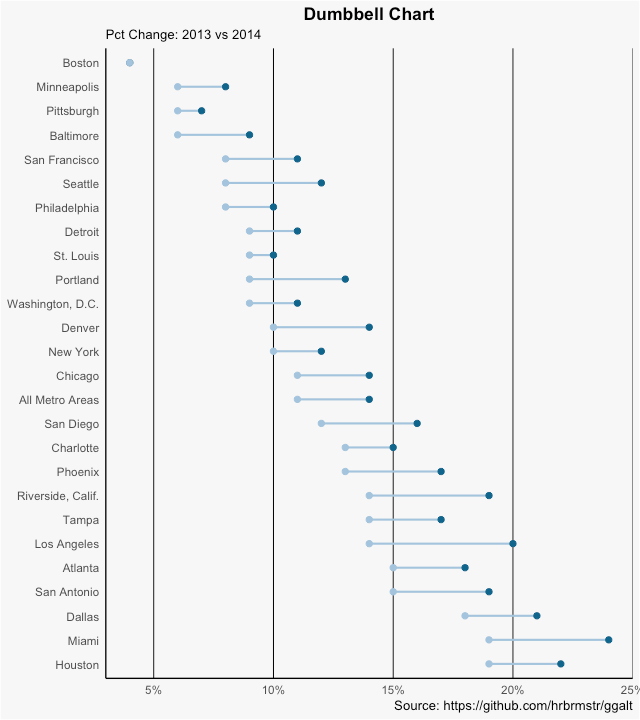
哑铃图
哑铃图适合展示两个时间点之间的相对位置,比较两个类别之间的距离。正确的哑铃图要求Y轴变量是一个因子,并且因子水平与指标顺序相同。
# devtools::install_github("hrbrmstr/ggalt")
library(ggplot2)
library(ggalt)
theme_set(theme_classic())
health <- read.csv("https://raw.githubusercontent.com/
selva86/datasets/master/health.csv")
health$Area <- factor(health$Area, levels=as.character(health$Area))
# health$Area <- factor(health$Area)
gg <- ggplot(health, aes(x=pct_2013, xend=pct_2014,
y=Area, group=Area)) +
geom_dumbbell(color="#a3c4dc",
size=0.75,
point.colour.l="#0e668b") +
scale_x_continuous(label=percent) +
labs(x=NULL,
y=NULL,
title="Dumbbell Chart",
subtitle="Pct Change: 2013 vs 2014",
caption="Source: https://github.com/hrbrmstr/ggalt") +
theme(plot.title = element_text(hjust=0.5, face="bold"),
plot.background=element_rect(fill="#f7f7f7"),
panel.background=element_rect(fill="#f7f7f7"),
panel.grid.minor=element_blank(),
panel.grid.major.y=element_blank(),
panel.grid.major.x=element_line(),
axis.ticks=element_blank(),
legend.position="top",
panel.border=element_blank())
plot(gg)
类型四: 分布
当拥有大量数据点并想要研究数据点的分布特点时,则可以画分布图。
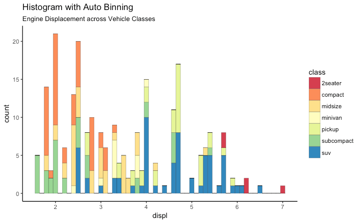
直方图
连续变量直方图一般可以通过geom_bar()或者geom_histogram()来实现。当使用geom_histogram()时,可以选择使用bin参数来控制柱子的数量。或者也可以通过设置binwidth来设置bin的范围。因为geom_histogram提供了控制箱数和binwidth的功能,因此一般可以选择geom_histogram来绘制直方图。
library(ggplot2)
theme_set(theme_classic())
# Histogram on a Continuous (Numeric) Variable
g <- ggplot(mpg, aes(displ)) +
scale_fill_brewer(palette = "Spectral")
g + geom_histogram(aes(fill=class),
binwidth = .1,
col="black",
size=.1) + # change binwidth
labs(title="Histogram with Auto Binning",
subtitle="Engine Displacement across Vehicle Classes")
g + geom_histogram(aes(fill=class),
bins=5,
col="black",
size=.1) + # change number of bins
labs(title="Histogram with Fixed Bins",
subtitle="Engine Displacement across Vehicle Classes")

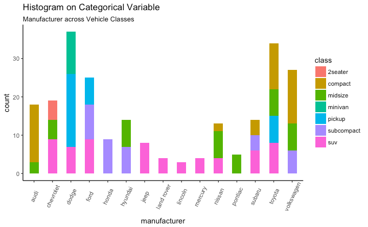
分类变量直方图
分类变量上的直方图将生成显示每个类别的条形图的频率图表。通过调整宽度,可以调整条形的厚度。
library(ggplot2)
theme_set(theme_classic())
# Histogram on a Categorical variable
g <- ggplot(mpg, aes(manufacturer))
g + geom_bar(aes(fill=class), width = 0.5) +
theme(axis.text.x = element_text(angle=65, vjust=0.6)) +
labs(title="Histogram on Categorical Variable",
subtitle="Manufacturer across Vehicle Classes")
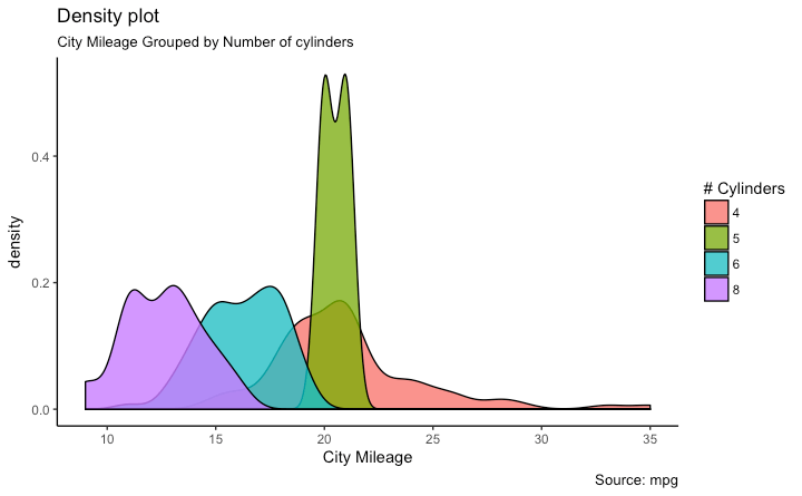
密度函数图 library(ggplot2)
theme_set(theme_classic())
# Plot
g <- ggplot(mpg, aes(cty))
g + geom_density(aes(fill=factor(cyl)), alpha=0.8) +
labs(title="Density plot",
subtitle="City Mileage Grouped by Number of cylinders",
caption="Source: mpg",
x="City Mileage",
fill="# Cylinders")
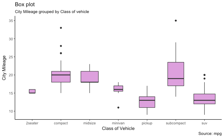
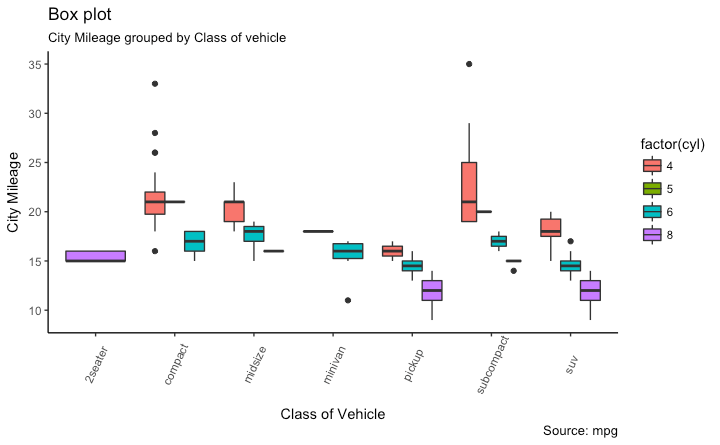
箱型图
箱形图是研究数据分布的一个好工具。它还可以显示多个组内的分布,以及中位数,范围和异常值。
箱型图框内的黑线代表数据的中位数,箱子的顶部和底部分布时数据的75%和25%的分位数。线条的终点距离为1.5*IQR,IQR为第25和第75百分位数之间的距离。线条以外的点衬之为异常点。
library(ggplot2)
theme_set(theme_classic())
# Plot
g <- ggplot(mpg, aes(class, cty))
g + geom_boxplot(varwidth=T, fill="plum") +
labs(title="Box plot",
subtitle="City Mileage grouped by Class of vehicle",
caption="Source: mpg",
x="Class of Vehicle",
y="City Mileage")
library(ggthemes)
g <- ggplot(mpg, aes(class, cty))
g + geom_boxplot(aes(fill=factor(cyl))) +
theme(axis.text.x = element_text(angle=65, vjust=0.6)) +
labs(title="Box plot",
subtitle="City Mileage grouped by Class of vehicle",
caption="Source: mpg",
x="Class of Vehicle",
y="City Mileage")
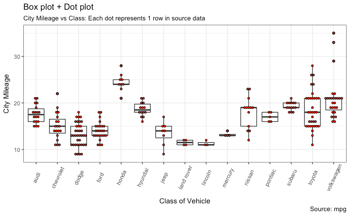
带点的箱型图
除了箱型图的基本信息外,点图可以为箱型图提供更多的信息,在图中每个点代表一个观察点。
library(ggplot2)
theme_set(theme_bw())
# plot
g <- ggplot(mpg, aes(manufacturer, cty))
g + geom_boxplot() +
geom_dotplot(binaxis='y',
stackdir='center',
dotsize = .5,
fill="red") +
theme(axis.text.x = element_text(angle=65, vjust=0.6)) +
labs(title="Box plot + Dot plot",
subtitle="City Mileage vs Class: Each dot represents 1 row
in source data",
caption="Source: mpg",
x="Class of Vehicle",
y="City Mileage")
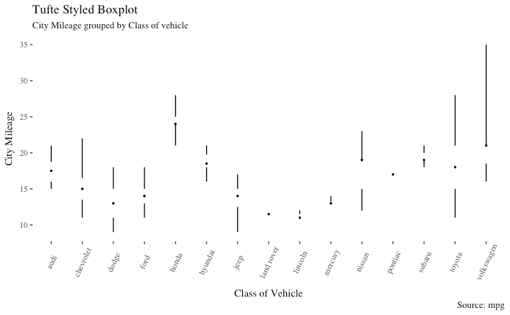
Tufte 箱型图 library(ggthemes)
library(ggplot2)
theme_set(theme_tufte()) # from ggthemes
# plot
g <- ggplot(mpg, aes(manufacturer, cty))
g + geom_tufteboxplot() +
theme(axis.text.x = element_text(angle=65, vjust=0.6)) +
labs(title="Tufte Styled Boxplot",
subtitle="City Mileage grouped by Class of vehicle",
caption="Source: mpg",
x="Class of Vehicle",
y="City Mileage")
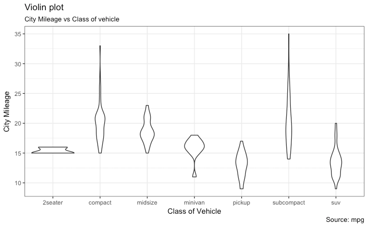
小提琴图
小提琴图与箱型图类似,但是小提琴图还包含了数据的密度函数图。
library(ggplot2)
theme_set(theme_bw())
# plot
g <- ggplot(mpg, aes(class, cty))
g + geom_violin() +
labs(title="Violin plot",
subtitle="City Mileage vs Class of vehicle",
caption="Source: mpg",
x="Class of Vehicle",
y="City Mileage")
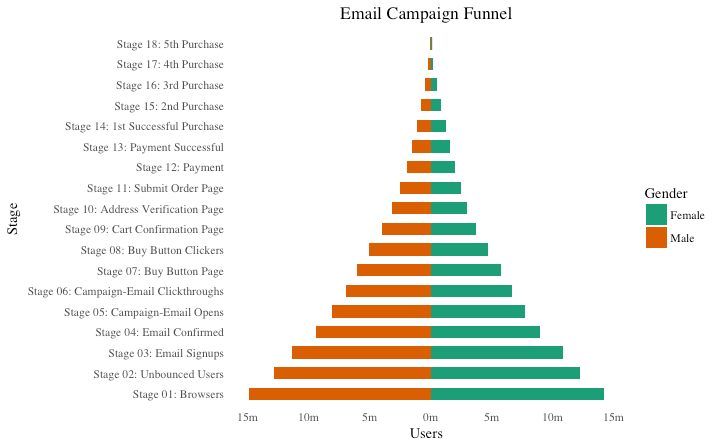
人口金字塔图
人口金字塔提供了一种独特的方式来可视化人口数量或人口百分比。下面的金字塔图,反映了在电子邮件营销活动渠道的每个阶段用户数。
library(ggplot2)
library(ggthemes)
options(scipen = 999) # turns of scientific notations like 1e+40
# Read data
email_campaign_funnel <- read.csv("https://raw.githubusercontent.com
/selva86/datasets/master/email_campaign_funnel.csv")
# X Axis Breaks and Labels
brks <- seq(-15000000, 15000000, 5000000)
lbls = paste0(as.character(c(seq(15, 0, -5),
seq(5, 15, 5))), "m")
# Plot
ggplot(email_campaign_funnel, aes(x = Stage,
y = Users, fill = Gender)) + # Fill column
geom_bar(stat = "identity", width = .6) + # draw the bars
scale_y_continuous(breaks = brks, # Breaks
labels = lbls) + # Labels
coord_flip() + # Flip axes
labs(title="Email Campaign Funnel") +
theme_tufte() + # Tufte theme from ggfortify
theme(plot.title = element_text(hjust = .5),
axis.ticks = element_blank()) + # Centre plot title
scale_fill_brewer(palette = "Dark2") # Color palette
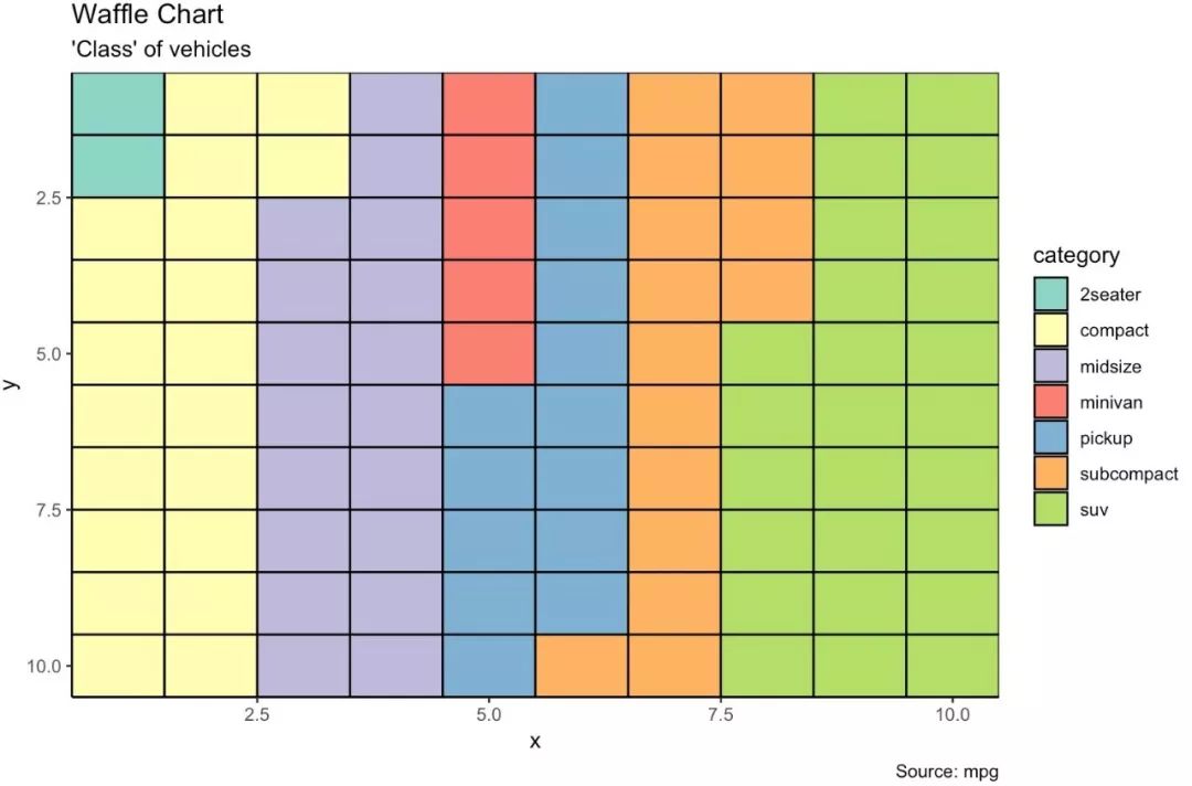
类型五: 组成 华夫饼图
华夫饼图通常可以用来显示总人口分类。我们可以通过ggplot2的geom_tile()函数实现华夫饼图。
var <- mpg$class # the categorical data
nrows <- 10
df <- expand.grid(y = 1:nrows, x = 1:nrows)
categ_table <- round(table(var) * ((nrows*nrows)/(length(var))))
categ_table
df$category <- factor(rep(names(categ_table), categ_table))
## Plot
ggplot(df, aes(x = x, y = y, fill = category)) +
geom_tile(color = "black", size = 0.5) +
scale_x_continuous(expand = c(0, 0)) +
scale_y_continuous(expand = c(0, 0), trans = 'reverse') +
scale_fill_brewer(palette = "Set3") +
labs(title="Waffle Chart", subtitle="'Class' of vehicles",
caption="Source: mpg")
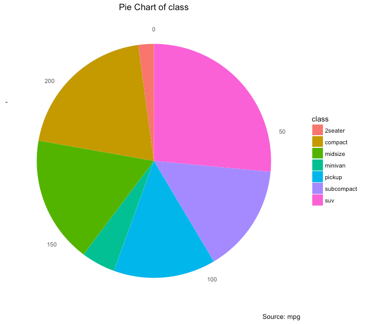
饼图
饼图是显示数据组成的一种重要方式,在ggplot中,需要通过coord_polar()函数来实现。
library(ggplot2)
theme_set(theme_classic())
# Source: Frequency table
df <- as.data.frame(table(mpg$class))
colnames(df) <- c("class", "freq")
pie <- ggplot(df, aes(x = "", y=freq, fill = factor(class))) +
geom_bar(width = 1, stat = "identity") +
theme(axis.line = element_blank(),
plot.title = element_text(hjust=0.5)) +
labs(fill="class",
x=NULL,
y=NULL,
title="Pie Chart of class",
caption="Source: mpg")
pie + coord_polar(theta = "y", start=0)
# Source: Categorical variable.
# mpg$class
pie <- ggplot(mpg, aes(x = "", fill = factor(class))) +
geom_bar(width = 1) +
theme(axis.line = element_blank(),
plot.title = element_text(hjust=0.5)) +
labs(fill="class",
x=NULL,
y=NULL,
title="Pie Chart of class",
caption="Source: mpg")
pie + coord_polar(theta = "y", start=0)
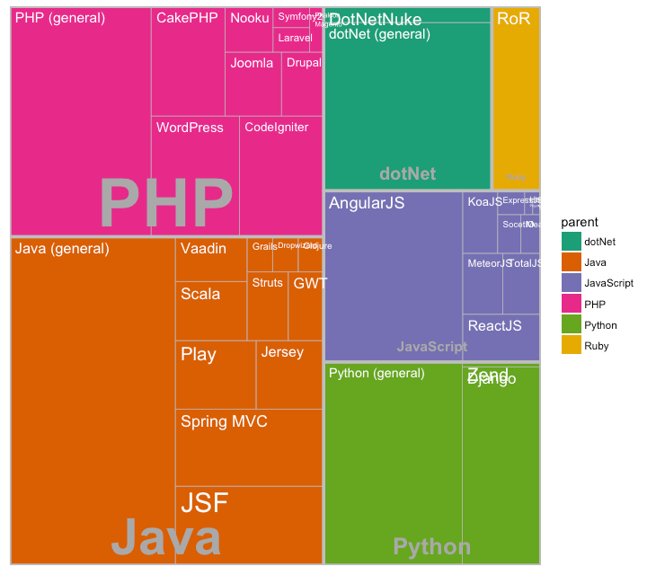
树形图
树形图是现实分层数据的好方法。在ggplot中,treemapify包含有树形图所需要的数据处理及绘图方法。
为了创建树形图,需要先将数据转换成treemapify()需要的数据格式。
library(ggplot2)
library(treemapify)
proglangs <- read.csv("https://raw.githubusercontent.com/
selva86/datasets/master/proglanguages.csv")
# plot
treeMapCoordinates <- treemapify(proglangs,
area = "value",
fill = "parent",
label = "id",
group = "parent")
treeMapPlot <- ggplotify(treeMapCoordinates) +
scale_x_continuous(expand = c(0, 0)) +
scale_y_continuous(expand = c(0, 0)) +
scale_fill_brewer(palette = "Dark2")
print(treeMapPlot)
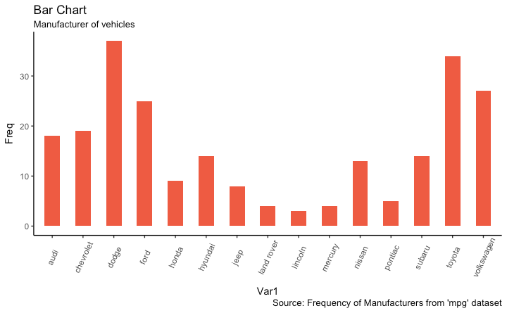
条形图 freqtable <- table(mpg$manufacturer)
df <- as.data.frame.table(freqtable)
library(ggplot2)
theme_set(theme_classic())
# Plot
g <- ggplot(df, aes(Var1, Freq))
g + geom_bar(stat="identity", width = 0.5, fill="tomato2") +
labs(title="Bar Chart",
subtitle="Manufacturer of vehicles",
caption="Source: Frequency of Manufacturers from
'mpg' dataset") +
theme(axis.text.x = element_text(angle=65, vjust=0.6))
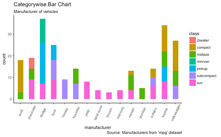
当然还可以按组对数据进行着色
# From on a categorical column variable
g <- ggplot(mpg, aes(manufacturer))
g + geom_bar(aes(fill=class), width = 0.5) +
theme(axis.text.x = element_text(angle=65, vjust=0.6)) +
labs(title="Categorywise Bar Chart",
subtitle="Manufacturer of vehicles",
caption="Source: Manufacturers from 'mpg' dataset")
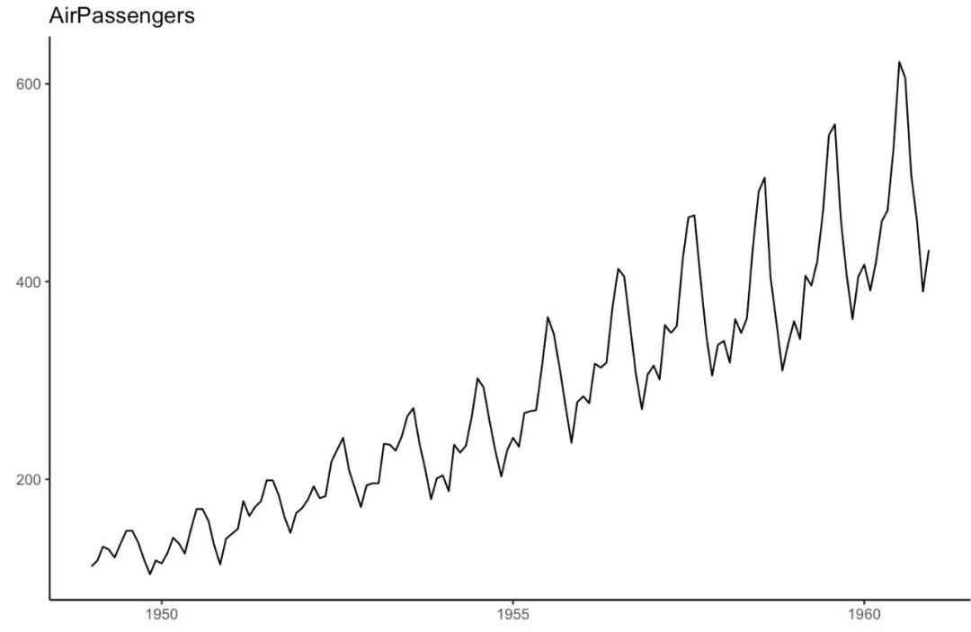
类型六:时序变化 时间序列图
ggfortify包支持autoplot函数直接从时间序列对象中自动绘制时间序列图。
## From Timeseries object (ts)
library(ggplot2)
library(ggfortify)
theme_set(theme_classic())
# Plot
autoplot(AirPassengers) +
labs(title="AirPassengers")
dataframe格式的时间序列图 library(ggplot2)
theme_set(theme_classic())
# Allow Default X Axis Labels
ggplot(economics, aes(x=date)) +
geom_line(aes(y=returns_perc)) +
labs(title="Time Series Chart",
subtitle="Returns Percentage from 'Economics' Dataset",
caption="Source: Economics",
y="Returns %")
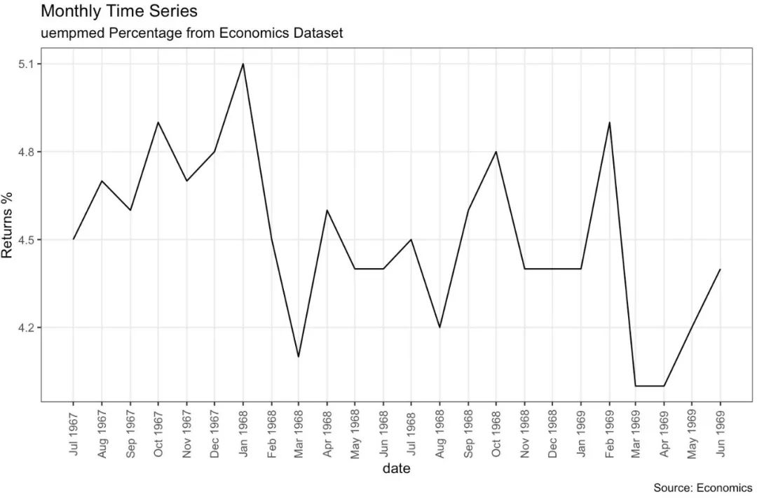
关于月度数据的时间序列图 library(ggplot2)
library(lubridate)
theme_set(theme_bw())
economics_m <- economics[1:24, ]
# labels and breaks for X axis text
lbls <- paste0(month.abb[month(economics_m$date)], " ",
lubridate::year(economics_m$date))
brks <- economics_m$date
# plot
ggplot(economics_m, aes(x=date)) +
geom_line(aes(y=uempmed)) +
labs(title="Monthly Time Series",
subtitle="Returns Percentage from Economics Dataset",
caption="Source: Economics",
y="Returns %") + # title and caption
scale_x_date(labels = lbls,
breaks = brks) +
theme(axis.text.x = element_text(angle = 90, vjust=0.5),
panel.grid.minor = element_blank())
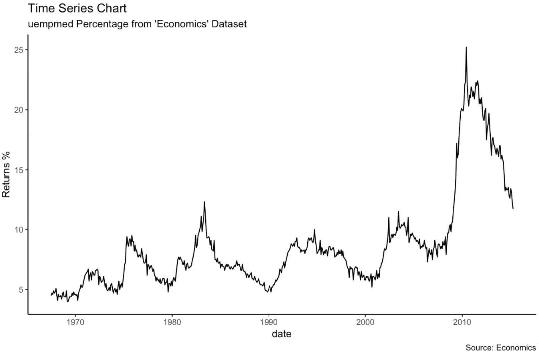
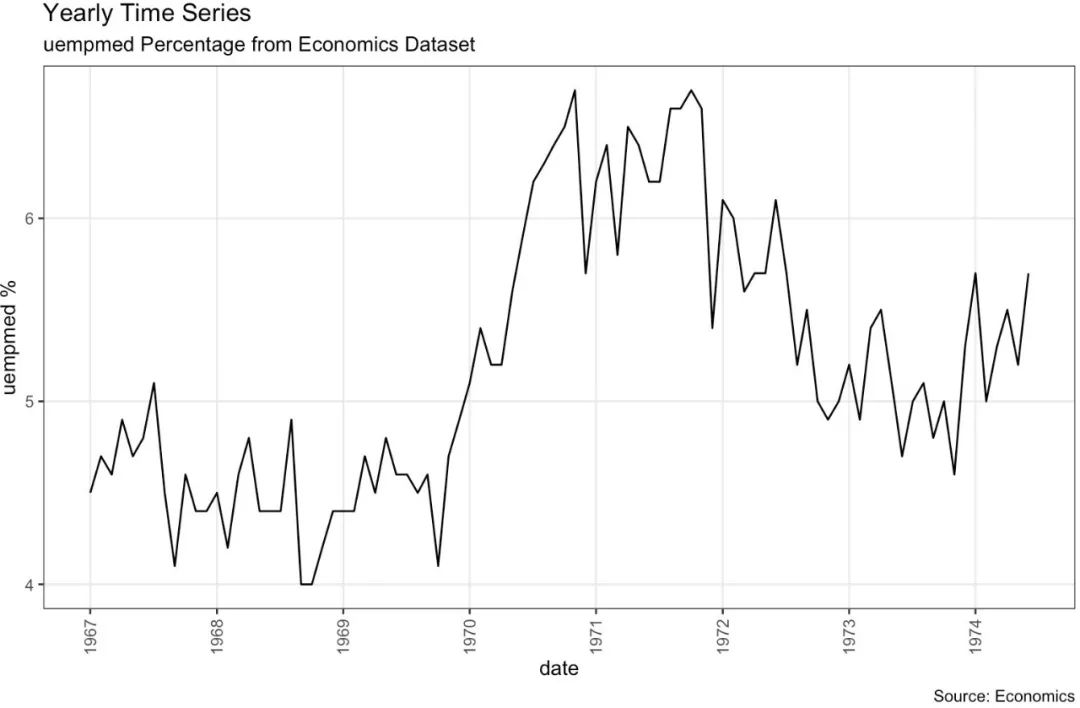
关于年度数据的时间序列图 library(ggplot2)
library(lubridate)
theme_set(theme_bw())
economics_y <- economics[1:90, ]
# labels and breaks for X axis text
brks <- economics_y$date[seq(1, length(economics_y$date), 12)]
lbls <- lubridate::year(brks)
# plot
ggplot(economics_y, aes(x=date)) +
geom_line(aes(y=uempmed)) +
labs(title="Yearly Time Series",
subtitle="uempmed Percentage from Economics Dataset",
caption="Source: Economics",
y="uempmed %") + # title and caption
scale_x_date(labels = lbls,
breaks = brks) +
theme(axis.text.x = element_text(angle = 90, vjust=0.5),
panel.grid.minor = element_blank())
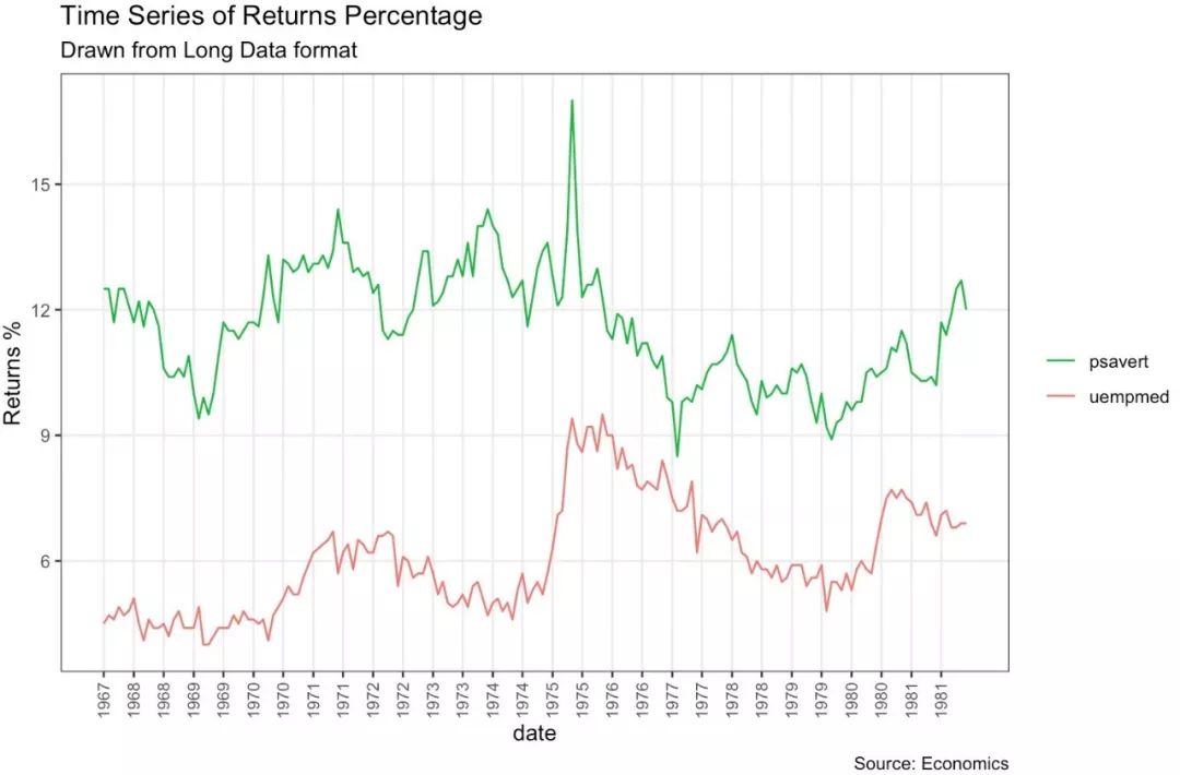
同时展示多个时间序列 data(economics_long, package = "ggplot2")
head(economics_long)
library(ggplot2)
library(lubridate)
theme_set(theme_bw())
df <- economics_long[economics_long$variable %in%
c("psavert", "uempmed"), ]
df <- df[lubridate::year(df$date) %in% c(1967:1981), ]
# labels and breaks for X axis text
brks <- df$date[seq(1, length(df$date), 12)]
lbls <- lubridate::year(brks)
# plot
ggplot(df, aes(x=date)) +
geom_line(aes(y=value, col=variable)) +
labs(title="Time Series of Returns Percentage",
subtitle="Drawn from Long Data format",
caption="Source: Economics",
y="Returns %",
color=NULL) + # title and caption
scale_x_date(labels = lbls, breaks = brks) +
scale_color_manual(labels = c("psavert", "uempmed"),
values = c("psavert"="#00ba38",
"uempmed"="#f8766d")) +
theme(axis.text.x = element_text(angle = 90, vjust=0.5, size = 8),
panel.grid.minor = element_blank())
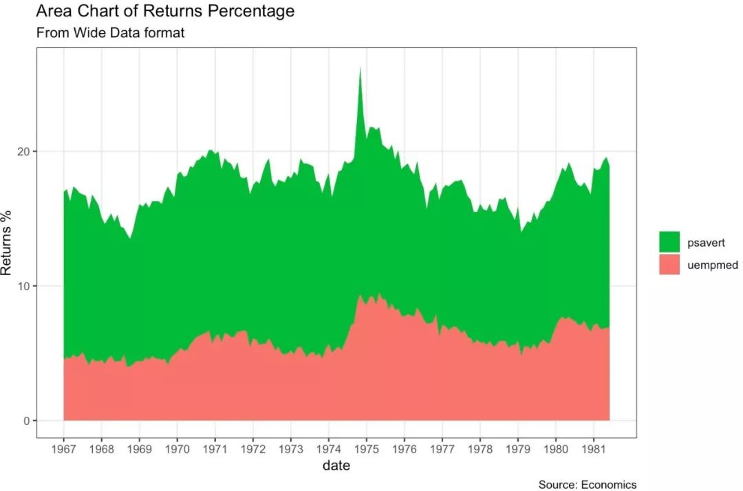
堆积图 library(ggplot2)
library(lubridate)
theme_set(theme_bw())
df <- economics[, c("date", "psavert", "uempmed")]
df <- df[lubridate::year(df$date) %in% c(1967:1981), ]
# labels and breaks for X axis text
brks <- df$date[seq(1, length(df$date), 12)]
lbls <- lubridate::year(brks)
# plot
ggplot(df, aes(x=date)) +
geom_area(aes(y=psavert+uempmed, fill="psavert")) +
geom_area(aes(y=uempmed, fill="uempmed")) +
labs(title="Area Chart of Returns Percentage",
subtitle="From Wide Data format",
caption="Source: Economics",
y="Returns %") +
scale_x_date(labels = lbls, breaks = brks) +
scale_fill_manual(name="",
values = c("psavert"="#00ba38", "uempmed"="#f8766d")) +
theme(panel.grid.minor = element_blank())
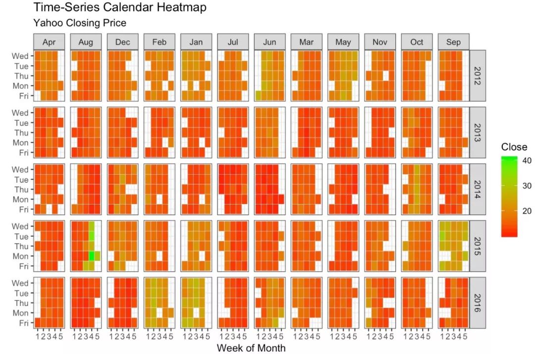
日历热图
当你想强调在日历格式中,数据变化情况(如股票数据),那么就可以使用日历热图。通过数据准备,我们可以用geom_tile函数来实现日历热图。
library(ggplot2)
library(plyr)
library(scales)
library(zoo)
df <- read.csv("https://raw.githubusercontent.com/selva86/datasets
/master/yahoo.csv")
df$date <- as.Date(df$date) # format date
df <- df[df$year >= 2012, ] # filter reqd years
# Create Month Week
df$yearmonth <- as.yearmon(df$date)
df$yearmonthf <- factor(df$yearmonth)
df <- ddply(df,.(yearmonthf), transform, monthweek=1+week-min(week))
df <- df[, c("year", "yearmonthf", "monthf",
"week", "monthweek", "weekdayf", "VIX.Close")]
# Plot
ggplot(df, aes(monthweek, weekdayf, fill = VIX.Close)) +
geom_tile(colour = "white") +
facet_grid(year~monthf) +
scale_fill_gradient(low="red", high="green") +
labs(x="Week of Month",
y="",
title = "Time-Series Calendar Heatmap",
subtitle="Yahoo Closing Price",
fill="Close")
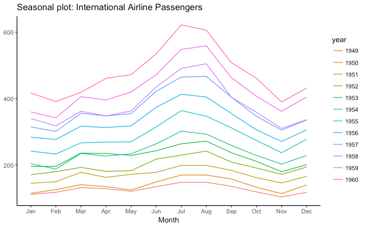
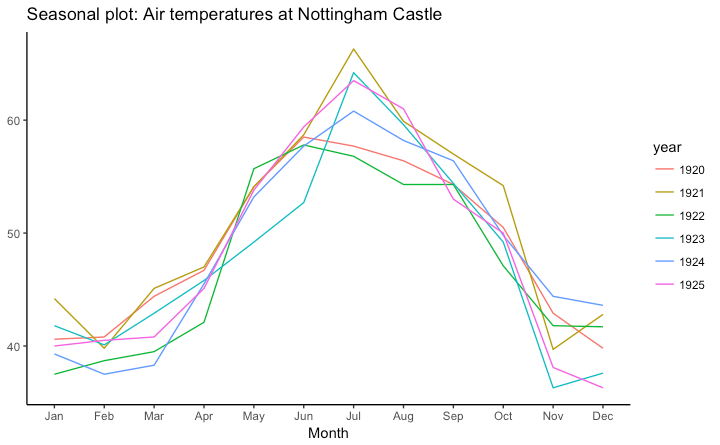
季节性时间序列 library(ggplot2)
library(forecast)
theme_set(theme_classic())
# Subset data
nottem_small <- window(nottem, start=c(1920, 1), end=c(1925, 12))
# subset a smaller timewindow
# Plot
ggseasonplot(AirPassengers) +
labs(title="Seasonal plot: International Airline Passengers")
ggseasonplot(nottem_small) +
labs(title="Seasonal plot: Air temperatures at Nottingham Castle")
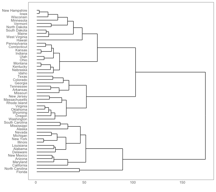
类型七: 分组 分层树形图 # install.packages("ggdendro")
library(ggplot2)
library(ggdendro)
theme_set(theme_bw())
hc <- hclust(dist(USArrests), "ave") # hierarchical clustering
# plot
ggdendrogram(hc, rotate = TRUE, size = 2)
组群
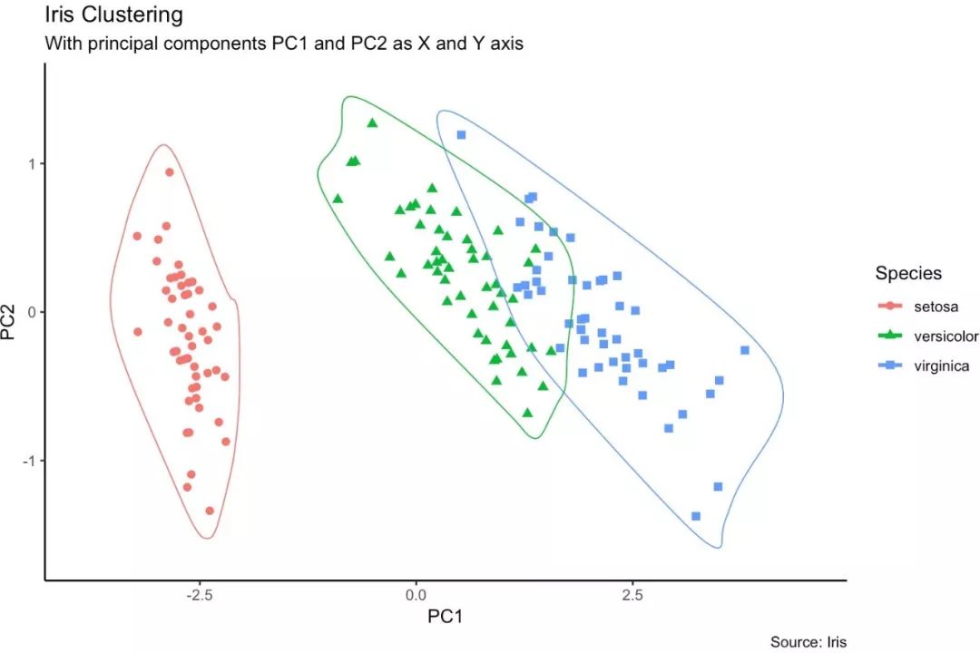
对于不同的数据蔟,我们可以用geom_encircle()来显示。如果数据存在多维特征,可以考虑采用PCA降维,并将第一主成分与第二主成分作为图形的X、Y轴。geomencircle()将需要突出的数据蔟包围起来,从而达到突出数据的作用。
# devtools::install_github("hrbrmstr/ggalt")
library(ggplot2)
library(ggalt)
library(ggfortify)
theme_set(theme_classic())
df <- iris[c(1, 2, 3, 4)]
pca_mod <- prcomp(df)
df_pc <- data.frame(pca_mod$x, Species=iris$Species)
df_pc_vir <- df_pc[df_pc$Species == "virginica", ]
df_pc_set <- df_pc[df_pc$Species == "setosa", ]
df_pc_ver <- df_pc[df_pc$Species == "versicolor", ]
# Plot ----------------------------------------------------
ggplot(df_pc, aes(PC1, PC2, col=Species)) +
geom_point(aes(shape=Species), size=2) +
labs(title="Iris Clustering",
subtitle="With principal components PC1 and
PC2 as X and Y axis",
caption="Source: Iris") +
coord_cartesian(xlim = 1.2 * c(min(df_pc$PC1), max(df_pc$PC1)),
ylim = 1.2 * c(min(df_pc$PC2), max(df_pc$PC2))) +
geom_encircle(data = df_pc_vir, aes(x=PC1, y=PC2)) +
geom_encircle(data = df_pc_set, aes(x=PC1, y=PC2)) +
geom_encircle(data = df_pc_ver, aes(x=PC1, y=PC2))
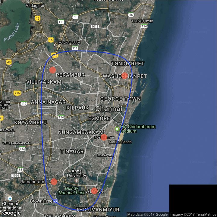
类型八: 空间可视化
ggmap包提供了与google maps api交互的工具,并获取要绘制的地点的坐标 。
# Better install the dev versions ----------
# devtools::install_github("dkahle/ggmap")
# devtools::install_github("hrbrmstr/ggalt")
# load packages
library(ggplot2)
library(ggmap)
library(ggalt)
# Get Chennai's Coordinates --------------------------------
chennai <- geocode("Chennai")
# Get the Map ----------------------------------------------
# Google Satellite Map
chennai_ggl_sat_map <- qmap("chennai", zoom=12,
source = "google", maptype="satellite")
# Google Road Map
chennai_ggl_road_map <- qmap("chennai", zoom=12,
source = "google", maptype="roadmap")
# Google Hybrid Map
chennai_ggl_hybrid_map <- qmap("chennai", zoom=12,
source = "google", maptype="hybrid")
# Open Street Map
chennai_osm_map <- qmap("chennai", zoom=12, source = "osm")
# Get Coordinates for Chennai's Places ---------------------
chennai_places <- c("Kolathur",
"Washermanpet",
"Royapettah",
"Adyar",
"Guindy")
places_loc <- geocode(chennai_places)
# Plot Open Street Map -------------------------------------
chennai_osm_map + geom_point(aes(x=lon, y=lat),
data = places_loc,
alpha = 0.7,
size = 7,
color = "tomato") +
geom_encircle(aes(x=lon, y=lat),
data = places_loc, size = 2, color = "blue")
# Plot Google Road Map -------------------------------------
chennai_ggl_road_map + geom_point(aes(x=lon, y=lat),
data = places_loc,
alpha = 0.7,
size = 7,
color = "tomato") +
geom_encircle(aes(x=lon, y=lat),
data = places_loc, size = 2, color = "blue")
# Google Hybrid Map ----------------------------------------
chennai_ggl_hybrid_map + geom_point(aes(x=lon, y=lat),
data = places_loc,
alpha = 0.7,
size = 7,
color = "tomato") +
geom_encircle(aes(x=lon, y=lat),
data = places_loc, size = 2, color = "blue") 街道地图
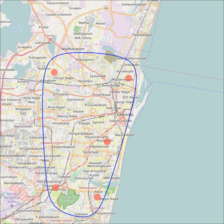
谷歌道路图

谷歌卫星地图